Digital art design, renderings, signatures and anything art related. Upload pictures of your newest work or ask for feedback. Post graphics requests or discuss art in general.
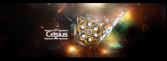
Good balance of light and dark. The color scheme is a bit monotone, but I think it works. Bit of yellow in there makes for some nice highlights to break up the green. My only complaint is that it's a render from the main site, so it won't be unique, but other than that it's great.
Kyco. The current signature you have. The block one. Do you still have a tutorial site for that. Ivebeen looking for that 1 for ages. Could you tell me? Please =]
Bakemaster wrote:Good balance of light and dark. The color scheme is a bit monotone, but I think it works. Bit of yellow in there makes for some nice highlights to break up the green. My only complaint is that it's a render from the main site, so it won't be unique, but other than that it's great.
Yeah but there isnt much "unique" renders, i mean i tried to search pic/renders of isy for my sig, but only 2 exists, 2 from the website :S
But all you need to do is make a sig and finish it, merge everything together, and then use the Rectangular Marquee Tool and Polygonal Lasso Tool to cut out the pieces. Just try and make like a puzzle or something like that .
Yea, i actually like the first one more than the pop-out one, with it popped out makes it seem like the moon is in front, but its supposed to be behind... , if you understand what i'm saying .