New sig
-
Saberdude

- Frequent Member
- Posts: 1087
- Joined: Thu Dec 14, 2006 3:47 am
- Quick Reply: Yes
- Location: On the Edge....Of Glory!!
Re: New sig
adding a little color wouldn't hurt.
Like another darksish color to complement the background.
Like another darksish color to complement the background.

-
Verfo

- Veteran Member
- Posts: 3655
- Joined: Thu May 01, 2008 12:21 am
- Quick Reply: Yes
- Location: evol efil
Re: New sig
hmm well first you have to make it a bit smaller, then there is too much empty space, but other than that good job
<< banned for proof of botting. -cin >>
-
aazumak

- Active Member
- Posts: 918
- Joined: Sat Jun 09, 2007 12:56 pm
- Quick Reply: Yes
- Location: Artist Corner
- Contact:
Re: New sig
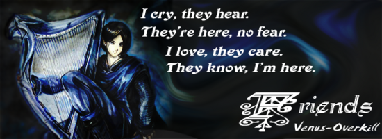
good to see you used the smudge tool, its very good that you made a sig only that way. Just keep making them man, if you have smudging down, then the rest will come easier. Also, the poem is nice, but it makes your sig have 2 focal points, I think that most sigs should only have 1 focal point, unless you are a god at photoshop and can pull a double focal off lol, its best to stay with one. But just keep the work up


_____________________!!!!!!Rogue 7X !!!!!!

-
Zeela12

- Regular Member
- Posts: 293
- Joined: Sat Aug 05, 2006 8:01 pm
- Quick Reply: Yes
- Location: Venus
- Contact:
Re: New sig
aazumak wrote:good to see you used the smudge tool, its very good that you made a sig only that way. Just keep making them man, if you have smudging down, then the rest will come easier. Also, the poem is nice, but it makes your sig have 2 focal points, I think that most sigs should only have 1 focal point, unless you are a god at photoshop and can pull a double focal off lol, its best to stay with one. But just keep the work up
Ahh... yeah that's a good point, always thought there's something weird about it. I might just have the poem blend into the background.
I actually didn't completely use the smudge tool, I used a lot of the artistic blurs and ripples and stuff, and just did hard light layer on black so it darks down.