Yeah, I plan to play around with colors a bit, and maybe do some gradianting, like sir bland has.
Actually, could you do it for me? You did it very well.
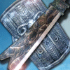
Eh, this didn't come out too bad..
-
NightShroud
- Regular Member
- Posts: 304
- Joined: Thu Jul 20, 2006 5:18 pm
- Quick Reply: Yes
- Location: Olympus
- Contact:


-
NightShroud
- Regular Member
- Posts: 304
- Joined: Thu Jul 20, 2006 5:18 pm
- Quick Reply: Yes
- Location: Olympus
- Contact:
-
NightShroud
- Regular Member
- Posts: 304
- Joined: Thu Jul 20, 2006 5:18 pm
- Quick Reply: Yes
- Location: Olympus
- Contact:
I've checked many, the problem is, most of them are $&!# =). Ya know, we should have a tutoral thread on sticky, people could link up good ones or something. That'd be cool.
Okay, I'll try. It might not come out too bad...BUT, I would like a recommendation on colors.
Okay, I'll try. It might not come out too bad...BUT, I would like a recommendation on colors.


-|IGN:NightShroud - 18 | Guild: SellSwords|- Thanks to MapleShilc for animation.
-
NightShroud
- Regular Member
- Posts: 304
- Joined: Thu Jul 20, 2006 5:18 pm
- Quick Reply: Yes
- Location: Olympus
- Contact:
-
NightShroud
- Regular Member
- Posts: 304
- Joined: Thu Jul 20, 2006 5:18 pm
- Quick Reply: Yes
- Location: Olympus
- Contact:


Much better. You actually did something this time. Some comments:
The bottom left corner doesn't appear as round as the top right. I'm not sure if it's just an upload problem or what.
Also, the outer glow is distracting to me. I like the idea of a glow, however. Three things I think you could try to do to make it better: 1.) Try a different color than white 2.) try making the outer glow Size larger so that it's not so focused and distracting 3.) try and find another way to make him glow. There's many other ways you can try...An idea that I have no idea would work is to create a layer underneath your thief and do some soft brush strokes around the edge of him. You can then mess with the brightness/contrast of that layer to give it more of a glow feel and lower the opacity if it stands out a ton. I have no idea if that'll look good but it's something you could try if you're lost on how to make him glow.
Since it's a signature, some sort of text would be nice.
You did much better this time. You have a theme and layout. There's something there. I'd say it's useable.

-
NightShroud
- Regular Member
- Posts: 304
- Joined: Thu Jul 20, 2006 5:18 pm
- Quick Reply: Yes
- Location: Olympus
- Contact:
First: I'm a black and white whore.
Second: I want people to notice I'm a thief, so I think it's good.
Third: I didn't use any outer glow =) I wanted to change the crappy blue, so I expiriment a few filters, it's solarize.
Fourth: I had to do all the rounding by hand,
(Circular fill, then color in the remaining area, and delete the circle with eliptical marquee.)
Fifth: It WOULD look fine, but the black won't go transparent.
So, it's stuck that way =).
Sixth: Thanks. Please redo opinions based on that information.[/quote]
Oh wait, if it's always going to come out black, I could fix the rounding issues.
Oh, here's an update.
-|IGN:NightShroud - 18 | Guild: SellSwords|- Thanks to MapleShilc for animation.