Planetscape - Cloud Planet

Digital art design, renderings, signatures and anything art related. Upload pictures of your newest work or ask for feedback. Post graphics requests or discuss art in general.
Post Reply
User avatar
crunked^
Hi, I'm New Here
Posts: 10
Joined: Mon Jul 24, 2006 8:50 pm

Planetscape - Cloud Planet

Post by crunked^ »

Well, this is my first attempt at a true planetscape (my third planet attempt). I might work on it more after I step away from it for a little while, but here it is:

Image

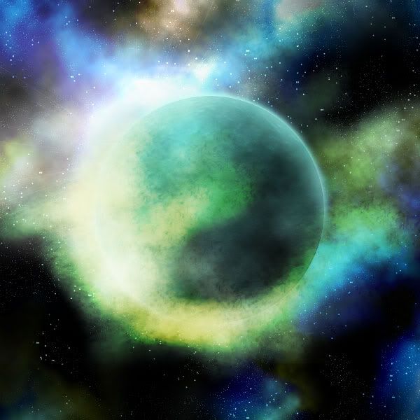
Things I'm not positive on:
-Color scheme
-Brush strokes on cloud (some are obvious)
-Brightness
-Starscape (it's kinda plane, I'm not very good at them)
-Might look a little cartoony (trying to go for a realistic look)
-The dark blue was actually supposed to be in the background with the stars but as it is it blends with the clouds. Not sure if I like it as it is.

I'd say this took about 2-3 hours. Done fully in Photoshop CS2. A lot more work could be done on it.

I get my inspiration from Greg Martin. I stumbled upon some of his tutorials about a year ago. He goes into a ton of detail, something that I'm not prepared or experienced enough to do.

http://gallery.artofgregmartin.com/

I'll keep updating it if I change it any.

EDIT:

I think I will be re-doing the starscape. If you look at pictures of planets in our solar system, you'll actually notice how few (if any) stars you see. So while technically you could explain all the stars in this picture as simply being in another galaxy, I think they detract from the overall picture. I will probably drastically reduce the amount of stars and will hopefully add more detail to them, but, like I said, I'm am horrible at stars.

Another thing I think will be cool is to add a second, smaller planet. That will give the planet a sense of scale and will really kind of open your eyes as you look at the picture. In addition, the clouds and such will also be forming around the second planet, giving the picture an added depth.

One thing I hate about creating digital art is the computer monitor variable. A lot of small things you don't catch on one screen you will see when you view the picture on another screen. Hell, even working in the dark can create unwanted effects. I once created a batman background for the PSP and I did it while in the dark. It ended up being way too dark, especially when I showed it to people on a message board with a white background.

Unfortunately I am going away tomorrow for about a week so I won't be able to work on this. :banghead:
Image

User avatar
Padawin
Regular Member
Posts: 321
Joined: Sun Jun 04, 2006 9:06 am
Quick Reply: Yes
Location: Babel

Post by Padawin »

gj :)
Image
Image

User avatar
Bakemaster
Senior Member
Posts: 4732
Joined: Fri Feb 10, 2006 7:06 pm
Quick Reply: Yes
Location: Babel

Post by Bakemaster »

My first instinct is that your clouds are waaaaaay too big. The atmosphere of a planet depends largely on its gravity, and I don't think you could get such an incredible amount of atmosphere with that amount of irregularity.

About the starscape, you've got smaller clusters of stars here and there, but nothing to suggest a local galaxy. Okay, fine, but the lower half of the picture just looks like you threw a handful of stars here and there and got tired before filling in between. The upper half is better. It could be good also with fewer stars as you were thinking, but don't rule out the idea of imagining your planet at a certain location in a certain type of galaxy (spiral, barred, elliptical, irregular) and drawing that in from the perspective of your planet (as our own spiral galaxy from our persective gives us not a spiral but the milky way).
LOL

User avatar
crunked^
Hi, I'm New Here
Posts: 10
Joined: Mon Jul 24, 2006 8:50 pm

Post by crunked^ »

Well, first of all it's Sci-fi. I was imagining a planet resting on clouds. Secondly, I didn't fill in stars. What you're seeing is two stars layers: one for smaller stars and one with larger stars. I then randomly erased stars from each layer. Basically what you're seeing is that I may have erased too many on the bottom. The only reason you're noticing it is because the bottom portion of the picture doesn't have much going on. In fact, if I flip the star layer so that the top is at the bottom, it looks almost as if I didn't put enough stars on the top (which is now the bottom).

The more I look at this picture now, however, it just looks too cartoony to me. I found a good tutorial on how to make a better planet surface so I might just work on something new when I get back.
Image

User avatar
Bakemaster
Senior Member
Posts: 4732
Joined: Fri Feb 10, 2006 7:06 pm
Quick Reply: Yes
Location: Babel

Post by Bakemaster »

About the clouds - I think the idea is cool, but just meant to say that it doesn't make sense as "a planet that behaves this way". The key word in "science fiction" is science, not fiction. But thinking about it again, I began to see it as perhaps a planet with no natural atmosphere, that had run into a cloud of gases; from that point of view, looking at it as an impact, a transition, it seems perfectly believable.

Anyway I'm just babbling here, trying to give you an idea of my thoughts in case it's helpful.
LOL

Post Reply

Return to “Artists Corner”