Digital art design, renderings, signatures and anything art related. Upload pictures of your newest work or ask for feedback. Post graphics requests or discuss art in general.
I'm an amateur too at this but I'll give a comment, I like what you tried to do with the sig, and I think you can still work some more magic to it. The face is a tad too bright, and blurred. If you tried to create a motion effect, you almost got there (maybe smudge? Idk :s). You don't have a strong focus. Text position isn't good for both; move the pic to the right and place text on the left? The colours are ok. It looks nice anyway overall 2.5/4.
<<banned from SRF for remaking a banned account. -SG>>
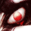
Her face is to blurry and the light source location isn't good. I don't like where you put the text, Try getting a focal and placing the text around there. Add a Light Source In The corner so it looks like she is running into the sunlight. Really nice effort
Barotix wrote:Her face is to blurry and the light source location isn't good. I don't like where you put the text, Try getting a focal and placing the text around there. Add a Light Source In The corner so it looks like she is running into the sunlight. Really nice effort
Lulz, yeah, I know what you mean. I don't really like it myself, was only trying to test that layers thing I was asking about before.
The text and focal placement needs work. Based on where you placed her, I don't think there's any good place to place the text (I recommend studying Rizla's Basic Tutorial in the Tut sticky located right in the AC Index). Edge text is a no no! Also do some blurring+sharpening work to add to the depth since ATM it looks flat. Just fix those small details. Then we can move onto more complicated things...
BrokenSaint wrote:The text and focal placement needs work. Based on where you placed her, I don't think there's any good place to place the text (I recommend studying Rizla's Basic Tutorial in the Tut sticky located right in the AC Index). Edge text is a no no! Also do some blurring+sharpening work to add to the depth since ATM it looks flat. Just fix those small details. Then we can move onto more complicated things...
Yah, atm I'm getting PS and then just gonna chill on sum tuts. I need practice, and I really think I went down with this one. Oh well.
Thanks for the comments though, it helps either way ^ ^
Agreed with Baro. But I think the light source should move further up in the corner. I like the text in the first one but I recommend putting a clipping mask on it so it looks well blended. I think you should keep the background blurred but not the focal. Edge text does work at certain times but usually not. I liked your last one more