Digital art design, renderings, signatures and anything art related. Upload pictures of your newest work or ask for feedback. Post graphics requests or discuss art in general.
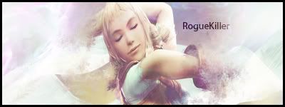
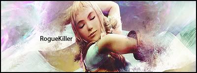
Incorporating your text into the image more would be my first piece of advice. One nice method I enjoy is by layermasking and somewhat altering the content of the mask. I would also give some lighting contrasts. The whole piece is bright with no dark areas. In art our eyes are most attracted to the greatest contrasting areas. Also, since you use two capital letters in your name, I suggest making it appear in either all lower, or uppercase form.
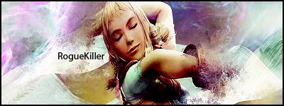
Here are just a couple adjustments I did to illustrate what I mean.
I would tone it down a bit more where the shadow from her arm is cast on her breast.
edit. some light blurring on the sides where its oversharpened would be a nice touch imo. its grabbing my eyes away from your name and focal point (the girl)