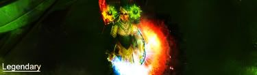
Digital art design, renderings, signatures and anything art related. Upload pictures of your newest work or ask for feedback. Post graphics requests or discuss art in general.
Looks bad ass, first time ?, few pointer try placing the text closer to your character. Play a little with "curves" and the contrast. It looks a bit to dark and over contrasted. V1 for me I like what you did with the "L". Good job.