Digital art design, renderings, signatures and anything art related. Upload pictures of your newest work or ask for feedback. Post graphics requests or discuss art in general.
the only thin gi would tell you to do is, rasterize your text layer(right click on it, then rasterize) then sharpen it, other than that its nice and simple
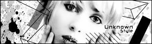
i really hate pop outs! i dont like cartoon sigs. the girl isnt blended. Keep the texts near each other. text on 2 different places makes your eyes look everywhere.
i agree, i like the light one much better, but the new 1 has better text
i would maybe make the original just a little bit darker, but like the new 1 is like 4 times as dark as it should be, it needs just a little bit of darkness