Digital art design, renderings, signatures and anything art related. Upload pictures of your newest work or ask for feedback. Post graphics requests or discuss art in general.
Ohhh I get it. Then I think it looks great like that. I thought you were trying to just cover up the background so I was thinking maybe you should have smudged it or something.
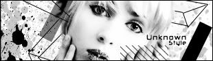
It's a little messy. Double text on either side of the tag is a no no. Creates multiple focals and kills the flow. Get rid of the outerglow on the text, it's a little overkill. Even though it's a little messy, it still looks good, just clean it up a tad.