Digital art design, renderings, signatures and anything art related. Upload pictures of your newest work or ask for feedback. Post graphics requests or discuss art in general.
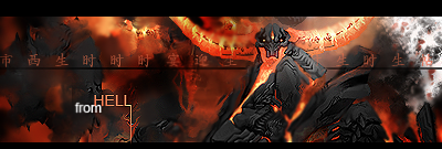
I do however think the render was a poor choice, though I've no idea what the selection for 'minions of hell' is like these days. Some nice smudging, and the render, despite being poor, is blended well...
What's the white crap on the right?
7/10
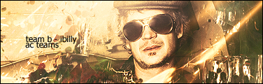
Permanently retired from Silkroad Online.
- Playing Lord of the Rings Online.
I do however think the render was a poor choice, though I've no idea what the selection for 'minions of hell' is like these days. Some nice smudging, and the render, despite being poor, is blended well...
What's the white crap on the right?
7/10
Don't you keep looking back and forth from the text and render?
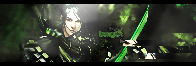
The text doesn't draw my attention really, which is a good thing. The render is what my eyes focus on, even though I think the render chosen blows monkey pole.
Permanently retired from Silkroad Online.
- Playing Lord of the Rings Online.
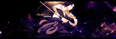
I do however think the render was a poor choice, though I've no idea what the selection for 'minions of hell' is like these days. Some nice smudging, and the render, despite being poor, is blended well...
What's the white crap on the right?
7/10
Don't you keep looking back and forth from the text and render?
Yeah +1. Too many distractions but I love the overall sig especially the background. I wanna know how you did that lol.