Latest piece.
-
NightShroud
- Regular Member
- Posts: 304
- Joined: Thu Jul 20, 2006 5:18 pm
- Quick Reply: Yes
- Location: Olympus
- Contact:
Latest piece.
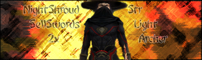
Rate. Also my first cut out. I did good first time, then got black screen error..This time I screwed up his hat a good bit.


-|IGN:NightShroud - 18 | Guild: SellSwords|- Thanks to MapleShilc for animation.
-
Bakemaster

- Senior Member
- Posts: 4732
- Joined: Fri Feb 10, 2006 7:06 pm
- Quick Reply: Yes
- Location: Babel
I like the background idea, but it's a little too contrast-y on the left side. Reeeeally light and then suddenly reeeeally dark. Maybe go for a spotlight effect by washing out the thief a bit and projecting a shadow on the background as though it were a wall? Or whatever. Never really cared what anyone's build is when looking at their signature. 6.5/10
LOL
-
NightShroud
- Regular Member
- Posts: 304
- Joined: Thu Jul 20, 2006 5:18 pm
- Quick Reply: Yes
- Location: Olympus
- Contact:
Bakemaster wrote:I like the background idea, but it's a little too contrast-y on the left side. Reeeeally light and then suddenly reeeeally dark. Maybe go for a spotlight effect by washing out the thief a bit and projecting a shadow on the background as though it were a wall? Or whatever. Never really cared what anyone's build is when looking at their signature. 6.5/10
I was going for contrast, I am a newbie to PS though.
By the way can I get a tutorial for the light rays type things? Kind of like in CrimsonNuker's sig.
-|IGN:NightShroud - 18 | Guild: SellSwords|- Thanks to MapleShilc for animation.
-
Bakemaster
- Senior Member
- Posts: 4732
- Joined: Fri Feb 10, 2006 7:06 pm
- Quick Reply: Yes
- Location: Babel
