Digital art design, renderings, signatures and anything art related. Upload pictures of your newest work or ask for feedback. Post graphics requests or discuss art in general.
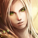
Alright,so unlike what I usually post this one is not finished yet. It's my second time with Smudging and I'm looking for extra elements I could add. What should I remove or add? I like it so far,but would appreciate new elements I could add in my next smudge tags.
Here's what I have so far.
Clean
Font Added (FairydustB + Black Stroke )
Last edited by Skyve on Thu Aug 12, 2010 9:28 am, edited 1 time in total.
Thats some very good smudging, About the text, I would suggest to move "Power of the crystals" little bit closer to the "Blood elf" text, but thats just my opinion ^^
TheKnight wrote:Thats some very good smudging, About the text, I would suggest to move "Power of the crystals" little bit closer to the "Blood elf" text, but thats just my opinion ^^
Do you mean bringing the "Power of the Crystal" more upwards? I tried but it just keeps jumping over "Blood Elf"
P.S: You'r Avatar is Farking sick. Please post the original signature