[Gallery]wildy0wns (me)

Digital art design, renderings, signatures and anything art related. Upload pictures of your newest work or ask for feedback. Post graphics requests or discuss art in general.
Post Reply
User avatar
ravenear
Hi, I'm New Here
Posts: 1
Joined: Thu Feb 26, 2009 12:52 am
Quick Reply: Yes
Location: my room =D

[Gallery]wildy0wns (me)

Post by ravenear »

hey guys, i use to play runescape yes runescape but it was a private server. =D. so i made sigs for people and i thought well since ive started sro i should show them what i have. there going to go from latest to oldest. ok here they are, rate them, use them but if u do pleases give me credit.
Image
Image
Image
Image
Image
Image
Image
Image
^horrible =D
Image
Image
Image
Image

User avatar
Squirt
Forum God
Posts: 8186
Joined: Sat Jan 05, 2008 9:48 pm
Quick Reply: Yes
Location: Off Topic

Re: [Gallery]wildy0wns (me)

Post by Squirt »

Not bad, hope that Hostage gives you comments they'll help.

What I can say is that you need to work on blending.
Image
Spoiler!

woutR wrote:Squirt, you're a genius when it comes to raping women.

User avatar
Kraq
Advanced Member
Posts: 2076
Joined: Sat Dec 15, 2007 3:44 am
Location: ☮☮☮

Re: [Gallery]wildy0wns (me)

Post by Kraq »

ravenear wrote:Image
Image
Image

These three are the best.
Look for some tutorials and your set.
http://planetrenders.net/forums/index.php?&showforum=81 best for beginners
If you have any questions, feel free to ask.
Image

User avatar
DumboDii
Addicted Member
Posts: 2961
Joined: Sat Sep 13, 2008 7:20 pm
Quick Reply: Yes
Location: Finland

Re: [Gallery]wildy0wns (me)

Post by DumboDii »

ravenear wrote:Image
Image


Am I only one thinking that those focals are stretched ? You should work with texts too. But nice start KIU.
Drop the beat

User avatar
Kirkaldi
Veteran Member
Posts: 3083
Joined: Thu Jul 31, 2008 2:50 am
Quick Reply: Yes
Location: nyc

Re: [Gallery]wildy0wns (me)

Post by Kirkaldi »

+1 to Kraq and DumboDii. kiu
Image

User avatar
RogueKiller
Loyal Member
Posts: 1893
Joined: Sat Jan 19, 2008 11:28 pm
Quick Reply: Yes
Location: GuildWars2

Re: [Gallery]wildy0wns (me)

Post by RogueKiller »


Those are shit. They make you worse. All they teach you is how to spam C4Ds and abuse the smudge tool.
Anyways...
Work on blending, Lighting and colors.
Your pieces have C4Ds all over the place. Try to control your effects so they look better.
As for lighting, think in terms of reality. If the light is coming from the left side of the face, the left side of the face should be lit, not the right.
Image

User avatar
CrimsonNuker
Dom's Slut
Posts: 13791
Joined: Sun Aug 06, 2006 3:31 am
Quick Reply: Yes
Location: guildwars2

Re: [Gallery]wildy0wns (me)

Post by CrimsonNuker »

Ugh this is the thing i hate to see most. Stretched renders.
ImageImageImage

User avatar
Squirt
Forum God
Posts: 8186
Joined: Sat Jan 05, 2008 9:48 pm
Quick Reply: Yes
Location: Off Topic

Re: [Gallery]wildy0wns (me)

Post by Squirt »

Yeah I have to agree with Rouge Killer, you won't learn anything unless you personally play around with all of the tools.

You should also press f1 and learn about all of the different things that you can do with Photoshop.
Image
Spoiler!

woutR wrote:Squirt, you're a genius when it comes to raping women.

User avatar
_Angels
Active Member
Posts: 707
Joined: Fri Nov 23, 2007 8:35 am
Quick Reply: Yes
Location: Artist corner

Re: [Gallery]wildy0wns (me)

Post by _Angels »

ya like ppl above me said alrddy most look like stretched stocks and renders u should try hold shift and make the stock smaller at top right or left or bottem right or left nvr make it smaller by top or right or left or else the stock doesnt look natural or is way stretched out anyways.

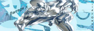
next to that i see alot of sigs with c4ds i guesse thats oke if ur a starter but if u would like to try something else with the c4d try making a other background with c4d use for a different kind of purpose, try putting it on soft light or overlay and smudge some of the spots where u can see its a c4d so it gives a more blending effect. Also try to find the good colors :) that match and are easy for the eye.
here is a sample of a good color sites :] http://www.colourlovers.com/

I would also try to put one last layer on the sig on overlay or an other blending option so the stocks would blend in more.

KIU :) love and peace :3
<< banned on request. -cin >>

Post Reply

Return to “Artists Corner”