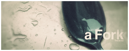
Tut - Soothing Images
Tut - Soothing Images
Here's my first tut:
http://melez102.deviantart.com/art/My-f ... -105324771
I hope someone learns something from it. Improvise a bit, use other adj layers, etc, etc... Post results, if any please!
http://melez102.deviantart.com/art/My-f ... -105324771
I hope someone learns something from it. Improvise a bit, use other adj layers, etc, etc... Post results, if any please!

Re: Tut - Soothing Images
svidja mi se
cool , i have some ideas in my mind thx to ure tut
cool , i have some ideas in my mind thx to ure tut
<< banned for proof of botting. -cin >>
- CrimsonNuker
- Dom's Slut
- Posts: 13791
- Joined: Sun Aug 06, 2006 3:31 am
- Quick Reply: Yes
- Location: guildwars2
Re: Tut - Soothing Images
CrimsonNuker wrote:Font. >_<
+1 the text isnt evenly spaced like
Line 1
Line 2
they are too close
it becomes a bad combo with the font

- Priam
- Forum Legend
- Posts: 7885
- Joined: Tue Jul 11, 2006 8:38 am
- Quick Reply: Yes
- Location: At the apple store, Cause i'm an iAddict.
Re: Tut - Soothing Images
First step when making a tutorial, is making sure people are actually able to read it. Since that's your main goal.
This font is horrible, and makes on-screen reading even harder then it allready is.
General rule of thumb:
- Headlines, heads, important statements, highlights = A typical Sans-serif font.
- Parts where people are gonna have to do some reading: A typical serif font. This font gets it's name from serifs (tails) on the non capital letters, that point towards the next letter/word thus making it easier to read/follow.
- Decorative fonts, is a whole other group, and typically used to be stupid on the net really

Re: Tut - Soothing Images
I dont get the first step, if I try Filter > Distort > Displace... there appears some really *****.. Im Displace it with the normal settings.
I have a Transparant layer, then I load my render (Layer 2) Than I try the Displace thing... What is the wrong move? ^^
Sjoerd, sorry for the bad English!
I have a Transparant layer, then I load my render (Layer 2) Than I try the Displace thing... What is the wrong move? ^^
Sjoerd, sorry for the bad English!


Re: Tut - Soothing Images
Heheh, thanks. Used this font on purpose, I love it, but will use your advice in next ones. Cheers.
@Sjoerd: I don't get what you mean. When you do the Distort>Displace filter your unresized render, it will become.. weird, but suitable for a BG. Make sure it flows well.
@Sjoerd: I don't get what you mean. When you do the Distort>Displace filter your unresized render, it will become.. weird, but suitable for a BG. Make sure it flows well.

Re: Tut - Soothing Images
Thats the problem it looks terrible and its just 1/5th of the whole sig in the middle of the Sig! 


- Jiggle
- Hi, I'm New Here
- Posts: 17
- Joined: Sun Dec 07, 2008 1:24 pm
- Quick Reply: Yes
- Location: Off Topic
Re: Tut - Soothing Images
Not so bad .... to be your first Tutorial 
- piXie_niXie
- Active Member
- Posts: 666
- Joined: Wed Feb 13, 2008 2:23 pm
- Quick Reply: Yes
- Location: Venice
Re: Tut - Soothing Images
I know.  Dunno how to watermark it tho. And I dunno how the dA watermark is going to work..

Re: Tut - Soothing Images
Melez wrote:I know.Dunno how to watermark it tho. And I dunno how the dA watermark is going to work..
You get Type Tool put Melez , turn it at an angle , lower opacity and vuala a water mark
:]


