
beauty saber
-
cin
Re: beauty saber
couple of things slightly off imo, but decent tag.
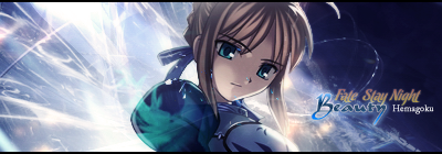
it seems to lack some depth. this may be because it's the
render/focal plus some effects and a solid dark background.
perhaps you could add some custom brushes next time so you
can add some shadow effects which would boost the depth.
another idea i got here is that it might look good if you
do something with her right shoulder (for us that's the
left one <_<). perhaps you could blend that in better, or
make it shatter outwards so that it looks cooler. idk >.>
and try to make the text simpler next time. it's a lot
better on the bottom sig you have, but on this one, the
text just seems too fancy for a rather plain sig.
kiu <3
-
fckerr

- Loyal Member
- Posts: 1914
- Joined: Mon Mar 17, 2008 5:02 pm
- Quick Reply: Yes
- Location: Bulgaria
Re: beauty saber
Thats one of the best sigs around that i've seen 