Digital art design, renderings, signatures and anything art related. Upload pictures of your newest work or ask for feedback. Post graphics requests or discuss art in general.
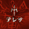
ok I know you said the gold thing on the left is the edge of her sword, but we cant tell that, only you know cause you made it, I would edit it out or find a way to make it easier to identify. Your focal point (the girl) is blurred, try sharpening it a tad for clarity. Move the text away from your focal slightly, or keep it there but have it interact with the girl, not like its just dropped in. I dont know what this face is in the lower right hand corner, but Im not digging it, it distracts and harms the flow of the image, its like getting derailed every time my eyes move across it. try to implement a contrasting color or effect behind and/or working with your focal point.
past that, I would hit up some tutorials on effects, lighting, depth, and color/color correction.
pretty much agree with Rizla, although I'd brighten up the face a bit, or darken the background (as it is, the big splash of red next to her face is more distracting than the character), but then I dislike dark things so it's your choice.
Ok thanks, that guy was slashed by her, took the shots from an anime called Claymore.
I guess i can take him and the sword out, cuz just by her face alone would invoke anger, and the red would help.
SuicideGrl wrote:you know what? you're an asshole. and you don't belong here. banned.
I still think the red is too bright, but again, that's personal opinion. Although it looks really weird with your avatar You're going to have to make really long posts to keep that from happening >.>
feba wrote:I still think the red is too bright, but again, that's personal opinion. Although it looks really weird with your avatar You're going to have to make really long posts to keep that from happening >.>
OI!!!! u just sendin me to do more work..avatar now rofl
SuicideGrl wrote:you know what? you're an asshole. and you don't belong here. banned.


You're going to have to make really long posts to keep that from happening >.>