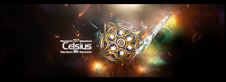
Digital art design, renderings, signatures and anything art related. Upload pictures of your newest work or ask for feedback. Post graphics requests or discuss art in general.
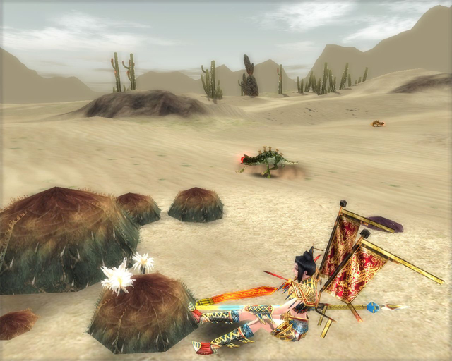
my current sig is my first attempt at photomanipulation. i looked through all the guides in this section of the site and decided i needed to learn a LOT more about photoshop, so i set out to take a nice SS of some flowers i found growing in takla:
and turn it into something even more beautiful. i TOTALL want all the criticism and suggestions i can get here... i am trying to denubify my PS skills :)
extra thanks to Ol3n and Shimohime, whose techniques as suggested in their guides were actually used in this experiment. <3
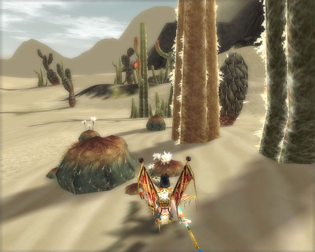
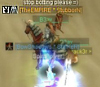
well, the white thingy on the left seem kinda random, and it looks as if your character is floating (while sitting)-- even in your screenshot, but more apparent in your sig. better screenshot angle?
happynoobing wrote:well, the white thingy on the left seem kinda random, and it looks as if your character is floating (while sitting)-- even in your screenshot, but more apparent in your sig. better screenshot angle?
lol you caught me. i google-image-searched for something decent to add some texture to it, and that was what i came up with. it IS random.
as for a better SS, now i have to find those damn flowers again zzzzz...
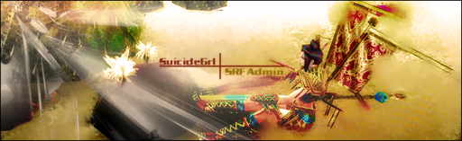
OLD SIG is better, maybe more glows or effects but i dont like sig what you have bellow. Look at mine its clean! Your oldone is clean too but thatone what you have putted now, i dont like it sorry.
CrimsonNuker wrote:2nd one is MUCH better, you can actually see the shadows
i put all the gfx on high and shadows as detailed rather than circle. it was a HuGE help. then the first thing i did was overlay a white-to-black gradient at a down-left angle, so the white was in the top right and the black was in the bottom left, and WOW it made the shadows pop even more. i added a render in the upper right and set it to soft light as a further light source then smudged the edges. the rest was just some gradient mapping, hue/saturation overlays, and another render which gave me the wispy tendrils of fog/smoke/clouds.
I too just started using photoshop yesterday ... Alot of the tut's here helped however suicidegrl some of these tut's Need to be stickyed!!! I would find one that helps, then go back to look and never find it again But i digress... Here is my magical creation of my dog Rendered and all that shiz myself Yea yea i know its lame... stfu already >.>
CrimsonNuker wrote:2nd one is MUCH better, you can actually see the shadows
i put all the gfx on high and shadows as detailed rather than circle. it was a HuGE help. then the first thing i did was overlay a white-to-black gradient at a down-left angle, so the white was in the top right and the black was in the bottom left, and WOW it made the shadows pop even more. i added a render in the upper right and set it to soft light as a further light source then smudged the edges. the rest was just some gradient mapping, hue/saturation overlays, and another render which gave me the wispy tendrils of fog/smoke/clouds.
Lol my computer would crash and burn if i set it to maximum gfx.
Thread hijacked ~~~~~~~~~~~~~~~~~~~~
I too just started using photoshop yesterday ... Alot of the tut's here helped however suicidegrl some of these tut's Need to be stickyed!!! I would find one that helps, then go back to look and never find it again But i digress... Here is my magical creation of my dog Rendered and all that shiz myself
The light is taking up most of the sig. Plain, no real flow like stated before...If it was a horizontal pic of you, and the flower, and making the flower stick out more, and the right lighting...hmm.
Last edited by Draquish on Sun Apr 15, 2007 3:14 pm, edited 2 times in total.
The light is taking up most of the sig. Plain, no real flow like stated before...If it was a horizontal pic of you, and the flower, and making the flower stick out more, and the right lighting...hmm.
ZOMG Shimo! i have been looking for some renders with white BGs.... all the ones i've been able to find have black ones and look shitty inverted. this will help immensely. <3
@draquish: ok, assumingi used the same stock for it, what could have been done differently?
and would SOMEONE PLEASE tell me what the hell a c4d is?? :P
As i said in that PM earlier, I really think its awesome. ESPECIALLY if you are new to this, its really amazing. Ill have to go look at the tutorials you mentioned. And thats the best way to use tutorials though, not copy them. but adopt some techniques into your own style of things. looking forward to your next one.


