Digital art design, renderings, signatures and anything art related. Upload pictures of your newest work or ask for feedback. Post graphics requests or discuss art in general.
NotToMessWith
Hi, I'm New Here
Posts: 20 Joined: Tue Apr 03, 2007 7:58 pm
Post
by NotToMessWith Sat Apr 07, 2007 10:37 pm
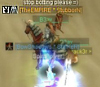
=) waiting for comments and idead how to make it better, thx =)[/url]
Luoma
Veteran Member
Posts: 3895 Joined: Thu Sep 14, 2006 8:23 amQuick Reply: YesLocation: Artists Corner & Aege
Post
by Luoma Sat Apr 07, 2007 10:53 pm
a little pixely font and abit big. but otherwise it looks good
7/10
<<banned from SRF for proof of botting. -SG>>
NotToMessWith
Hi, I'm New Here
Posts: 20 Joined: Tue Apr 03, 2007 7:58 pm
Post
by NotToMessWith Sat Apr 07, 2007 10:55 pm
yeah its so pixely cuz of the Stroke which is set up to center ... :/ ... and now i see that its really to big ^^ thx for reply size was changed =)
Luoma
Veteran Member
Posts: 3895 Joined: Thu Sep 14, 2006 8:23 amQuick Reply: YesLocation: Artists Corner & Aege
Post
by Luoma Sat Apr 07, 2007 11:01 pm
NotToMessWith wrote: yeah its so pixely cuz of the Stroke which is set up to center ... :/ ... and now i see that its really to big ^^ thx for reply size was changed =)
much nicer
<<banned from SRF for proof of botting. -SG>>
NotToMessWith
Hi, I'm New Here
Posts: 20 Joined: Tue Apr 03, 2007 7:58 pm
Post
by NotToMessWith Sat Apr 07, 2007 11:05 pm
thaaaaaaaaaaaaaaank you ! =) ... c´mon guys ... more replys ^^
rek
Ex-Staff
Posts: 5607 Joined: Sun Dec 31, 2006 10:46 amQuick Reply: YesLocation: darkroot garden
Contact:
Post
by rek Sun Apr 08, 2007 2:50 am
its a little plain imo but it looks good 6/10
<3
0len
Avalanche
Site Contributor
Posts: 3606 Joined: Mon Jan 30, 2006 4:08 amQuick Reply: YesLocation: guildwars2
Post
by Avalanche Sun Apr 08, 2007 4:54 am
Yeah, what reK said. Good sig though.
Draquish
Elite Member
Posts: 6423 Joined: Wed Mar 15, 2006 10:25 pmQuick Reply: YesLocation: ____
Post
by Draquish Sun Apr 08, 2007 5:10 am
I like the fact that you REZIZED the sig so two could fit in the same space without stretching the page too much.