Digital art design, renderings, signatures and anything art related. Upload pictures of your newest work or ask for feedback. Post graphics requests or discuss art in general.
you can do this with a white background too i just used this one first you hit the shrink (also make sure you have the whole thing selected) then set it to like 15 (you can experiment with it) you will get something like this then click grow set it to like 10 (don't go over the shrink or it will cancel) you will get something like this then click invert will get something like this then add alpha channel by right clicking the layer then press delete and your done :p
Last edited by Amarisa on Sun Sep 13, 2009 7:41 am, edited 4 times in total.
ofy1993 wrote:You should post it here as well so we can see it without having to go to page 1 and new comes will just see all of it on page 1.
I'm new to this too but I'l try CnC'ing.
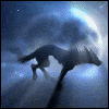
First of all the render is not all in the sig. Cut out the guys legs out of the sig or make your sig bigger.
Also, don't use the round edges. It looks good from time to time, but when 5 sigs (random number) you do in a row all have that effect it just looses interest.
Also, from the top, the guy has a shadow outside the background. Doesn't look good. You should make him a bit smaller so he fits inside.
The background looks a bit dull. See how the render looks high quality, titan like armor which has a metal effect. Whereas your background has a dull, dark material kind of look. You should try to balance them out so the sig has a better flow and more understanding of one "style".
Again, if I sound like a dick or harsh anywhere, tell me cause I don't mean to. I just wanna tell you what I see that would help your sigs ^^
ofy1993 wrote:You should post it here as well so we can see it without having to go to page 1 and new comes will just see all of it on page 1.
I'm new to this too but I'l try CnC'ing.
First of all the render is not all in the sig. Cut out the guys legs out of the sig or make your sig bigger.
Also, don't use the round edges. It looks good from time to time, but when 5 sigs (random number) you do in a row all have that effect it just looses interest.
Also, from the top, the guy has a shadow outside the background. Doesn't look good. You should make him a bit smaller so he fits inside.
The background looks a bit dull. See how the render looks high quality, titan like armor which has a metal effect. Whereas your background has a dull, dark material kind of look. You should try to balance them out so the sig has a better flow and more understanding of one "style".
Again, if I sound like a dick or harsh anywhere, tell me cause I don't mean to. I just wanna tell you what I see that would help your sigs ^^
i was not going to use the rounded edges all the time it just so happens it looks nice with this one. also i miss a few things the world is not gana end i can just patch it up
Good to see the sigs get better as there more you do. Keep going and you will pick up a unique style suited to you...
Currently Playing CSRO, Looking For People to Join Me, PM Me for Details IGN:Kezemz | Build:Cold/Lightning/Force Nuker | Lvl:1x | Guild:Currently Looking
Sacchin wrote:I really like the new sigs, you're doing great =) I like the nice color tone choices you're using also.
thx ^^
and now i wait until i'm motivated to make a sig. the topic of angels came along and i got inspired to do a angel sig. went to PlanetRenders.net and found an angel pic lol.
ofy1993 wrote:Seriously, this one is amazing. Really great work ^^ Now I'm starting to get jealous of you . I love the angel, wings, and the overall color. I give it a 10/10 :3

i always wanted to do that


