Page 1 of 1
NSR ~ IPone
Posted: Sun Oct 05, 2008 6:46 pm
by binnosh
Quick and easy one, but it's been a while, i like em clean :p
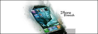
been a long time since i had time to play around with photoshop so i thought i'd have some fun with the most basic tools and went smudging a bit :p
Re: NSR ~ IPone
Posted: Sun Oct 05, 2008 7:01 pm
by Kraq
Looks great, but those //// Look kinda odd there.
Re: NSR ~ IPone
Posted: Sun Oct 05, 2008 7:37 pm
by IceCrash
it's to give da flow nabcake

Re: NSR ~ IPone
Posted: Sun Oct 05, 2008 7:38 pm
by Kraq
I know but it looks odd :[
Re: NSR ~ IPone
Posted: Sun Oct 05, 2008 8:54 pm
by binnosh
noes :p
it's to make the flow have a V shape :p
edit, changed the direction of the scanlines so it would go with the flow of the sig, looks better :p
Re: NSR ~ IPone
Posted: Sun Oct 05, 2008 8:57 pm
by Bob
Its very flat :/
Re: NSR ~ IPone
Posted: Sun Oct 05, 2008 9:00 pm
by IceCrash
i think its great honestly lol
Re: NSR ~ IPone
Posted: Sun Oct 05, 2008 9:02 pm
by binnosh
yeh i thought so too,
it's so simple it looks nice imo

, kinda surprised me when i saw the outcome. Random smudging ftw!
Re: NSR ~ IPone
Posted: Sun Oct 05, 2008 9:07 pm
by Hostage
It's really boring, sorry.
Try moving the box of diagonal lines closer and under the text and change the colour to add a bit more colour to the whole piece. Speaking of text try finding another font the current one is just adding to the "blandness" of the tag. Now that I got my cons aside I do love the smudging looks like an extension of the wave BG on the phone. Real water colour like.
Other then that nice work definitely one of the higher skilled tags I've seen lately in the AC. Hope to see a lot more from you.

Re: NSR ~ IPone
Posted: Sun Oct 05, 2008 9:10 pm
by binnosh
cheers
might be making some more if i get some more free time inbetweens chool and going out for drinks
i'll go check around for some better fonts :p
Re: NSR ~ IPone
Posted: Sun Oct 05, 2008 10:21 pm
by RogueKiller
Looks more like a work in progess.
That white background needs to go imo. It should be covered by the smudge that surrounds the phone so it doesn't look so plain.
Re: NSR ~ IPone
Posted: Mon Oct 06, 2008 12:58 am
by Kirkaldi
You should put a background, other than that, I like it.
Re: NSR ~ IPone
Posted: Mon Oct 06, 2008 4:50 am
by binnosh
nah if i'd smudge trhe entire background, or put something in it the abstract effect would be lost, i might put in some extra things but i won't fill the background
Re: NSR ~ IPone
Posted: Mon Oct 06, 2008 1:52 pm
by Melez
RogueKiller wrote:Looks more like a work in progess.
That white background needs to go imo. It should be covered by the smudge that surrounds the phone so it doesn't look so plain.
Agreed.
Re: NSR ~ IPone
Posted: Mon Oct 06, 2008 6:23 pm
by lavapockets
binnosh wrote:nah if i'd smudge trhe entire background, or put something in it the abstract effect would be lost, i might put in some extra things but i won't fill the background
+1 and my only comment....
