Page 1 of 1
NsR ~ Blackmail
Posted: Thu Oct 02, 2008 8:39 pm
by Melez

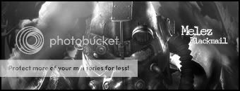
Newest work, pretty much proud of it.
ive got a feelin everyone will need some time to see wat is on the tag -.-Which one is better/CnC/Rate/should I use it as a sig?

Re: NsR ~ Blackmail
Posted: Fri Oct 03, 2008 2:22 am
by Kraq
Looks like a suit, am i right? :]
Looks good, but if you have a feeling people will be like "what's that" then I'm guessing that means, no focal. Looks good though 8/10 :]
IceCrash wrote:i'm very happy that you feel proud about it, nothing can take that away from you

I think your current sig is your best, just make a few touch ups :]
Re: NsR ~ Blackmail
Posted: Fri Oct 03, 2008 2:51 am
by Kirkaldi
I don't like the smudge on the right, it's too blurry.
Re: NsR ~ Blackmail
Posted: Fri Oct 03, 2008 4:39 am
by Melez
Kirkaldi wrote:I don't like the smudge on the right, it's too blurry.
Not smudged.

Re: NsR ~ Blackmail
Posted: Fri Oct 03, 2008 5:22 am
by ON3.OF.A.KiiND
They are very nice IMO colour sig is better,
WD KPU

Re: NsR ~ Blackmail
Posted: Fri Oct 03, 2008 9:57 am
by Melez
ON3.OF.A.KiiND wrote:They are very nice IMO colour sig is better,
WD KPU
WD KPU?? Wtf?
Re: NsR ~ Blackmail
Posted: Fri Oct 03, 2008 4:40 pm
by HOLLAstir
The majority of it looks over-smudged. Needs more depth to the piece, seems rather flat right now. Tone down the light source, and change the text. B/w looks better.