Digital art design, renderings, signatures and anything art related. Upload pictures of your newest work or ask for feedback. Post graphics requests or discuss art in general.
render isnt very blended very well and the quality looks like it was cut from the manga :[
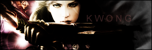
but background is pretty simple, to many Mosaics/squares IMO. Filters rock, but when it becomes obvious which one you used, or that it looks like it is the only one you used, its bad.
The key to mosaics is to blend mosaics in slightly in a few areas and to erase them in the general areas. It looks a lot better to like that. Talented people pull it off like breathing. (I'm not one, just saying look at good people's who use mosaics, its not all over the place.
started playing again... yet again! omg! - on rome
I agree with thekwong that there should be a little less mosaic in the sig. The other thing is that the lower border of the rectangle is showing through his hand, get rid of that - and while we're at it, the hand is too big, I know it's for perspective and in the context of the manga it may have made sense, but I'd try reducing it a little for the sig, as long as it still looks natural of course.