Page 1 of 1
NSR ~ Shinigami
Posted: Thu Jul 24, 2008 7:13 pm
by Kraq

V2:
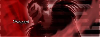
CnC is greatly appreciated

Re: NSR ~ Shinigami
Posted: Thu Jul 24, 2008 9:06 pm
by Verfo
Colors dont match, the render doesnt fit with the background, the background doesnt look good, the render doesnt look good 5/10, not your best man, i really liked the ichigo one
Re: NSR ~ Shinigami
Posted: Thu Jul 24, 2008 9:12 pm
by crazyskwrls
yeah i can barely see it, at first i thought it was a glare...
Re: NSR ~ Shinigami
Posted: Fri Jul 25, 2008 1:19 am
by Kraq
I didn't really wanna match the color with the stock since it would be to light. The stock was b&w at first but I was just playing with effects. Red's my fav color so thats why I did that, but thanks :]
Re: NSR ~ Shinigami
Posted: Fri Jul 25, 2008 12:37 pm
by IceCrash
you know
i think the bg is actually pretty good!
i think it woulda been a lot better if the render would be "normally" seen, and u'd blend it in with the bg, i think it'd look a lot better then :p
Re: NSR ~ Shinigami
Posted: Fri Jul 25, 2008 7:17 pm
by Kraq
Thanks IceCrash :] I'll do that now.
Re: NSR ~ Shinigami
Posted: Fri Jul 25, 2008 7:40 pm
by IceCrash
Kraq wrote:Thanks IceCrash :] I'll do that now.
see mate
isn't it a lot better now?
Re: NSR ~ Shinigami
Posted: Fri Jul 25, 2008 7:46 pm
by Verfo
look nice but work on the font a bit
Re: NSR ~ Shinigami
Posted: Fri Jul 25, 2008 7:50 pm
by IceCrash
Verfo wrote:look nice but work on the font a bit
Have you watched Death Note mate?
if you did you can understand why he chose that font :p
Re: NSR ~ Shinigami
Posted: Fri Jul 25, 2008 7:54 pm
by IceCrash
anyways mate, try this
Or add a 1px black border or a 2px white border, w.e you like.
also, try to Blur/smudge some places of the bg to give it a lil bit of depth maybe, just try ti and see how it looks xD
Also, if you want, make 7 or so duplicated layers than smudge em all, or just some, or w.e and see how it looks (this helps to blend the render with the bg most of the times)
Re: NSR ~ Shinigami
Posted: Fri Jul 25, 2008 8:01 pm
by Verfo
IceCrash wrote:Verfo wrote:look nice but work on the font a bit
Have you watched Death Note mate?
if you did you can understand why he chose that font :p
havent watched it thats probably why
Re: NSR ~ Shinigami
Posted: Fri Jul 25, 2008 10:24 pm
by Kraq
IceCrash wrote:anyways mate, try this
Or add a 1px black border or a 2px white border, w.e you like.
also, try to Blur/smudge some places of the bg to give it a lil bit of depth maybe, just try ti and see how it looks xD
Also, if you want, make 7 or so duplicated layers than smudge em all, or just some, or w.e and see how it looks (this helps to blend the render with the bg most of the times)
Thanks, I'll try that too!
I'm still a newbie when it comes to PS and I've made 50+ sigs :s So, thats a little complicated for me