Page 1 of 1

Feed Back plz

Posted: Sat Jun 17, 2006 12:14 am
by Chosn1
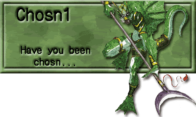
So I just made some sigs and wanted to get some feedback on wat looks good and wat not:

Image
Image
Image
Image
Image

Any feedback is welcomed :D :D :D

Posted: Sat Jun 17, 2006 10:13 am
by Nannari
For the chakji sig, i think it would look better if the head stuck out some too, so that you get rid of the fact that u've cut his head off :O

Other than that, i'unno

Posted: Sat Jun 17, 2006 10:56 am
by Chosn1
yeah i didn't realize how funky it looked untill i had made my post :banghead: I was thinkin' the same thing.

Posted: Sat Jun 17, 2006 1:39 pm
by Bakemaster
Nannari wrote:For the chakji sig, i think it would look better if the head stuck out some too

You are destroying my soul.