Digital art design, renderings, signatures and anything art related. Upload pictures of your newest work or ask for feedback. Post graphics requests or discuss art in general.
Better than your last one Things that need changes imo 1. the blue c4d is just distracting and a bit smudging around the render wouldnt hurt ( blending smudge ) the text could be better but its ok.. 7/10
YangKang wrote:Better than your last one Things that need changes imo 1. the blue c4d is just distracting and a bit smudging around the render wouldnt hurt ( blending smudge ) the text could be better but its ok.. 7/10
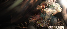
yeah i saw the blending wasnt the best.. forgot to safe a psd though :/.. so cant edit..
The colour looks horrible, and definately does not suit the C4D renders you've put in there, the render is also too small and badly blended, the text doesn't fit in well either.
iSROINACTIVE Current server: Neptune Level: 72 Character name: Jilbab Build: Full Str Bow Weapon: 72+5 Blessed Moon Bow SWSRO Current server: Server2 Level: 88 Character name: Jilbab Build: Full Str Bow Weapon: 85+5 Bow
Jilbab wrote:The colour looks horrible, and definately does not suit the C4D renders you've put in there, the render is also too small and badly blended, the text doesn't fit in well either.


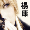
Things that need changes imo 1. the blue c4d is just distracting and a bit smudging around the render wouldnt hurt ( blending smudge ) the text could be better but its ok.. 7/10