Page 1 of 1
Constructive Criticism
Posted: Sun Apr 06, 2008 4:33 am
by RogueKiller
Re: Constructive Criticism
Posted: Sun Apr 06, 2008 4:47 am
by theblindarcher
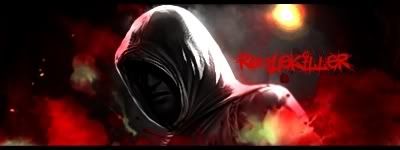
maybe a hawk for the assassins creed dude idk but i think it awesome
Re: Constructive Criticism
Posted: Sun Apr 06, 2008 9:31 am
by Swindler
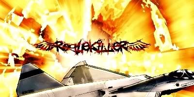
First one:
You have 2 focal points. The text and that airplane. Just use one focal point. The airplane pops out alot, blend it more. And the text doesnt really fit the piece.
Second one:
Its little bit dark. Lighten it up more. I like the smudging on the left side, the Smudging on the right side is a little bit off. And the text doesnt fit.
Third One:
This piece is also a little bit dark. Lighten it up. Text at Corners = NONO! Dont really know what you have done with this piece.. Looks like you only added text and made it darker. I would like to see the stock.
Re: Constructive Criticism
Posted: Sun Apr 06, 2008 3:32 pm
by Deviant
The only thing I see really wrong with it are the texts, try some simpler fonts
Re: Constructive Criticism
Posted: Sun Apr 06, 2008 3:55 pm
by Deadsolid
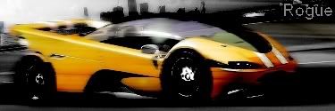
1)Resize the middle one. Make it smaller. Even smaller than the last one.
2)Dublicate the smoky red layer twice and set the two top layers to overlay. Usually it will make the red a bit more vibrant.
3)Alternatively, try to make the hood a bit darker. The light source and light on the hood dont seem to match.
4)You can try making the border a little thicker but whatever looks best should be kept.
I really like that middle one. It just needs some finishing touches.