Page 1 of 1
superman
Posted: Mon Mar 24, 2008 9:02 pm
by N1TROX
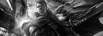
New superman tag

and heres a different version (less effects , b&w)
Posted: Mon Mar 24, 2008 9:35 pm
by HOLLAstir
Color for sure. Pretty hawt. /jealous
Re: superman
Posted: Tue Mar 25, 2008 12:44 am
by aazumak
colors are sick, text is nice

it kinda lacks depth, its all to dark, but it looks nice
Re: superman
Posted: Tue Mar 25, 2008 2:17 am
by N1TROX


2 color versions of the simple b&w
Re: superman
Posted: Tue Mar 25, 2008 2:44 am
by Panu
to me its like theres too much stuff happening. at first sight, i really couldnt tell wat it was till i really "studied" it. it also looks like you just placed some things in and set them to overlay and what not. it seems like theres more than 1 focal. dont get me wrong, its still a good piece but i've seen you do better. 7/10
Re: superman
Posted: Tue Mar 25, 2008 5:48 am
by Faiien
there are alot of flaws in this sig...not your best work