Page 1 of 1
NSR'Slide
Posted: Mon Mar 17, 2008 10:37 pm
by Snudge
Txt colour Txt clipp. mask
Txtless
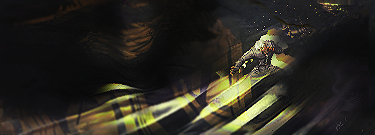
Something slightly different. No smudging, no C4D's.

C'nC?
Re: NSR'Slide
Posted: Mon Mar 17, 2008 10:46 pm
by aazumak
yay i go the first post on this awsome siggy!
with text is the best, and it pwns!!!
its a great text and i like the effect, its really original, so i think its wonderful, only thing i would like is for it to be a bit brighter around the guy to draw my attention in more(give some light in the layer below the guy

)
Re: NSR'Slide
Posted: Mon Mar 17, 2008 10:48 pm
by Snudge
aazumak wrote: only thing i would like is for it to be a bit brighter around the guy to draw my attention in more(give some light in the layer below the guy

)
Agreed. Trying to find a way without entirely Farking up the sig's contrast though. Already used too much luminosity grad maps.
/ponder
Re: NSR'Slide
Posted: Mon Mar 17, 2008 10:52 pm
by Millenium
Amazing sig Snudge! I see you really like sprite sigs eh? Man, this is just showing how we Apples rule

Few things though, I'd love to see a light source or something or the darkened area a bit brighter, and the poor sprite is kind of LQ.
How did you make the effects without the C4Ds? I totally demand a tutorial for this!!
Great job again!
Re: NSR'Slide
Posted: Mon Mar 17, 2008 10:52 pm
by 0l3n
Looks great snudge, ill be doing a few sprites to (all my other stocks are used up

.
The second one is the best in the bunch just try to enhance the txt a teeny tiny bit because the "S" looks to distorted.
Re: NSR'Slide
Posted: Mon Mar 17, 2008 10:54 pm
by aazumak
hmm, ive never touched those, i gotta try it out
to do my idea, i would take a layer with the render in it, duplicate it, bring it to the top, erase its feet so it blends in, then just use the dodge tool to brighten it up
like
render with feet gone
(image>apply image of the entire sig)
[^^ now just dodge this layer ^^]
Re: NSR'Slide
Posted: Mon Mar 17, 2008 10:57 pm
by HOLLAstir
Dodge/burn tool, or you can always make a new layer fill it with white, throw it on overlay or linear dodge, lower the opacity and erase the parts you don't want highlighted. Simple, but gets the job done.
OT:
I like it, although a few things I don't like about it too. The flow is good, although I'd like to see some of the lines distorted with more movement to them. It's hard for me to tell that he's sliding, when I only see from his waist up. I'd like to see more of his body, you cut him off to quickly. Text is ok, but it's too big, it overpowers your sprite and pretty much steals the spotlight.
Re: NSR'Slide
Posted: Mon Mar 17, 2008 11:52 pm
by Snudge
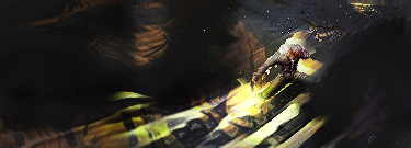
V2 added. Removed text versions

Re: NSR'Slide
Posted: Mon Mar 17, 2008 11:53 pm
by Snudge
Hershey wrote:i liek the flow in this piece
but kinda hard to see what it is.
Agreed, tbh. Shouldn't have resized the sprite this much. Ah well. :/
Re: NSR'Slide
Posted: Tue Mar 18, 2008 1:39 am
by aazumak
i like v2 alot more, but put the text back m8


)