Page 1 of 1
NSR ~ Katze
Posted: Thu Mar 13, 2008 2:35 pm
by Swindler
Maybe entering it in sigwars.. just wants some comments first

C'n'C
Re: NSR ~ Katze
Posted: Thu Mar 13, 2008 2:41 pm
by Priam
Thug Poetry is way better imo.
Re: NSR ~ Katze
Posted: Thu Mar 13, 2008 2:53 pm
by Swindler
Priam wrote:Thug Poetry is way better imo.
yeah but i suck to do b/w sigs ^^
Re: NSR ~ Katze
Posted: Thu Mar 13, 2008 8:20 pm
by Snudge
For a b/w sig its too bright and lacking in effects.
Pro tip:
B/W pretty much equals good texture, effects, flow and not too much brightness since it'll be ruined once BW. Dont focus on the colours at all. Just keep a b/w grad map at the top of your layers so you can see every now and then how it looks in BW, and what to change.

Re: NSR ~ Katze
Posted: Thu Mar 13, 2008 8:54 pm
by 0l3n
Snudge has a point, dont focus on color.
Just have to say it, I LOVE BLACK AND WHITE!!


Re: NSR ~ Katze
Posted: Thu Mar 13, 2008 9:07 pm
by Snudge
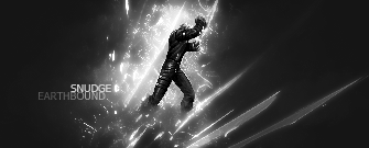
Just a small example:

Looks bad because the focus was on colour, smoothness.

Looks
much better because the effects were a focus for me. not colours or smoothness.
B/W needs to be crisp, and has to have some parts of the BG that stand out, while not drawing attention away from the focal.


