Digital art design, renderings, signatures and anything art related. Upload pictures of your newest work or ask for feedback. Post graphics requests or discuss art in general.
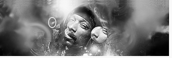
I really like the B/W version. Only thing I would have changed is making the size of the sig smaller only because it looks a bit empty to me. Other wise really cool ^^. 8/10.
Hostage wrote:I really like the B/W version. Only thing I would have changed is making the size of the sig smaller only because it looks a bit empty to me. Other wise really cool ^^. 8/10.
Only problem with that is if I do it then the sig will look more square because I cant take off more from the top and bottom.
It looks druggy <3 But i guess its what its supposed to look like. Hehe You've really got the atmosphere there. The lighting could use a bit of fix though. Good job!
Light source is a little harsh. Don't like the clipping mask next to his face. And the tag itself seems "empty." I like the effects at the bottom, did a good job with that, aswell as the over-all feel of the tag. Text isn't my favorite, but it's alright. I'd like to see more depth. Still a good tag.


