Page 1 of 1
NSR (Unnamed) for myself <3
Posted: Tue Feb 12, 2008 11:26 pm
by Millenium
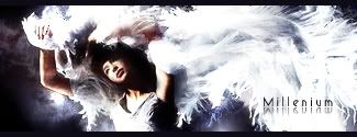
I found a nice stock with some beautiful movements so I decided to make a sig for myself. It was a quick one, I didn't spend too much time on it because I didn't want fancy effects since the original picture was really pretty. I did spend a lot of time perfecting the lighting and the colors, so it came pretty natural I think. It kind of reminds me of the Dream tag Holla made, but its probably because of the stock.
Please leave your comments/critiques/rating.
V1:
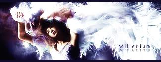
V2
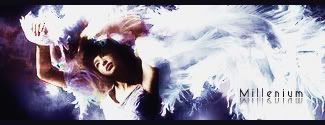
V3
 V4
V4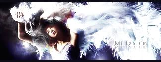
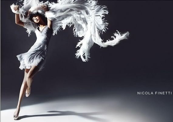
Original
http://i187.photobucket.com/albums/x5/m ... /index.jpg
Re: NSR (Unnamed) for myself <3
Posted: Wed Feb 13, 2008 12:20 am
by HOLLAstir
V1 for me. I don't like the harsh purple clashing with the more soft blue/purple you have going on. I like the flow, the stock looks a little LQ, might want to sharpen it up. Text is too far away from the focal. And just personally, I don't like that mirror effect on the text with this tag. Good over all feel from it, like I said, really like the flow.
Re: NSR (Unnamed) for myself <3
Posted: Wed Feb 13, 2008 12:35 am
by christina
HOLLAstir wrote:V1 for me. I don't like the harsh purple clashing with the more soft blue/purple you have going on. I like the flow, the stock looks a little LQ, might want to sharpen it up. Text is too far away from the focal. And just personally, I don't like that mirror effect on the text with this tag. Good over all feel from it, like I said, really like the flow.
+1.
Holla, havent seen you in a while

Re: NSR (Unnamed) for myself <3
Posted: Wed Feb 13, 2008 1:26 am
by Millenium
Thanks for the comments Holla. When i put a blueish gradient on Saturation it turned some parts pink/purple. I liked it at first but crashing colors like that is definitely a bad idea. So I urased the gradient from covering those parts. (And i didn't even know I can do that >.>)
The text is not your favorite, not many ppl's favorite but it is going to stay. The Text in here is simple yet artistic and its 3D following the sig's atmosphere. I could have arranged some texts but everything I tried just looked flat. Though it IS kind of away from the focal, disrupting the flow, so I made it lighter. V4 is here.
Also it was impossible to sharpen this thing because it looks really nasty when I do. The original stock was in a super good quality but I've resized it few times, so that could be the problem.
Re: NSR (Unnamed) for myself <3
Posted: Wed Feb 13, 2008 2:00 am
by HOLLAstir
Just use the sharpen tool at a low %.
Re: NSR (Unnamed) for myself <3
Posted: Wed Feb 13, 2008 7:44 pm
by Snudge
That's awesome, milly.

I love to see how well you're progressing.
Re: NSR (Unnamed) for myself <3
Posted: Wed Feb 13, 2008 9:56 pm
by Cursed One
i love it, i really like the version 2 and 3 because they have more colour to them ^.^
Re: NSR (Unnamed) for myself <3
Posted: Wed Feb 13, 2008 10:16 pm
by Millenium
Cursed One wrote:i love it, i really like the version 2 and 3 because they have more colour to them ^.^
Its true, that's what I thought in the beginning but HOLLA mentioned those colors didn't work too well and I agree the purple is kind of distracting...
Snudge wrote:That's awesome, milly.
I love to see how well you're progressing.
Awww why thank you <3 I love watching the collection of my sigs too and it really shows I'm doing better!
Re: NSR (Unnamed) for myself <3
Posted: Wed Feb 13, 2008 10:19 pm
by HOLLAstir
V4 looks much better
Re: NSR (Unnamed) for myself <3
Posted: Thu Feb 14, 2008 7:45 am
by rek
I like v1. But i think the brightness kills the focal alittle bit. 7/10
Re: NSR (Unnamed) for myself <3
Posted: Thu Feb 14, 2008 4:25 pm
by Millenium
.rek wrote:I like v1. But i think the brightness kills the focal alittle bit. 7/10
I think you're right. But if I make the wings less bright there won't be much flow, it will lose the entire feeling of the sig.