Page 1 of 1
Latest Sig
Posted: Sun Feb 10, 2008 9:18 am
by _HeLLioN_
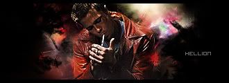
I tried using
Broken Saint's .PSD tutorial and this is the result.
Comments?
Re: Latest Sig
Posted: Sun Feb 10, 2008 10:44 am
by iNunoPT
i guess...hmm... stock doesnt fit the style?
i mean, i think you should try another stock cuz...imo its hard to understand the stock in this one
Re: Latest Sig
Posted: Sun Feb 10, 2008 11:31 am
by Doron
I like.. really BS style..
Re: Latest Sig
Posted: Sun Feb 10, 2008 11:34 am
by _Angels
lol i like it..
8/10

Re: Latest Sig
Posted: Sun Feb 10, 2008 7:29 pm
by _HeLLioN_
Thanks for the comments.
Any ideas on text?
I just sort of slapped one on there.
Re: Latest Sig
Posted: Sun Feb 10, 2008 7:41 pm
by YangKang
His face should be brighter because of the light source and about the text try playing around with Arial ? Dunno
Re: Latest Sig
Posted: Sun Feb 10, 2008 7:44 pm
by Cursed One
it looks nice but i think it just dont fit together as they should
Re: Latest Sig
Posted: Sun Feb 10, 2008 9:11 pm
by WaX
Looks nice hellion, maybe blend a lil on those loose edges and maybe a few little fx around the focal might look alrite, but ye i like it.