Page 1 of 1
NSR (Wait not yet I need help!!) Coca Cola
Posted: Thu Jan 31, 2008 2:14 pm
by Millenium
I'm taking this siggy request since hitman's got a good render there.
viewtopic.php?f=56&t=77430Right now I REALLY need hep with text. I've tried everything and its not working out. Looks my ooold Arial/Verdana font isn't looking good anymore, and this is the first time i've seriously had trouble with text. It just seems undoable.
I would love to hear some recommendations on fonts (not what you use) that'll fit well with this sig and its placement. V1: iRIP your idea Hostage ^^ <3
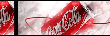
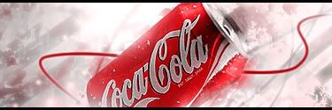
V2: The traditional
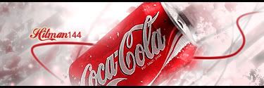
Text v1:

Text v2:
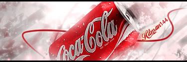
Text v3:
Original:
http://www.freedigitalphotos.net/image/ ... f-coke.jpg
Re: NSR (Wait not yet I need help!!) Coca Cola
Posted: Thu Jan 31, 2008 4:39 pm
by Dystopia
You can use the coca cola font here
http://www.dafont.com/loki-cola.fontand try a (i forgot the name, mask something i havent photoshoped in a while)
the way i did my text in my 1st sig, im not sure, it
could work
Re: NSR (Wait not yet I need help!!) Coca Cola
Posted: Thu Jan 31, 2008 4:43 pm
by Millenium
Heheh I have that Loki Cola font downloaded and experimented but honestly, it looks way too clusterred with the text on the cola bottle as well as the text hitman specified.
I think the mask is a great idea actually ^^ I was too fixed in thinking what solid color I should use. Thanks for the eye-opener Dyssy ^^
Re: NSR (Wait not yet I need help!!) Coca Cola
Posted: Thu Jan 31, 2008 4:48 pm
by Dystopia
Millenium wrote:Heheh I have that Loki Cola font downloaded and experimented but honestly, it looks way too clusterred with the text on the cola bottle as well as the text hitman specified.
I think the mask is a great idea actually ^^ I was too fixed in thinking what solid color I should use. Thanks for the eye-opener Dyssy ^^
np

EXACTLY like me, thats why I end up using the layer options to pimp the text or I end up masking it.
Re: NSR (Wait not yet I need help!!) Coca Cola
Posted: Thu Jan 31, 2008 5:12 pm
by Millenium
Masking looks weird in this case. I think the problem with this piece is the actual flow and where the text should be if its best and natural looking.
I've upated the thread with 3 versions of text. Still welcoming more comments
@Dystopia - I love how the mask wokes on your first sig. I guess its because it has a thick font though. Clipping masks didn't work too wel with my thin fonts I had.
Re: NSR (Wait not yet I need help!!) Coca Cola
Posted: Thu Jan 31, 2008 10:28 pm
by Hitman144
i like 3rd version i will use

, thanks very much

Re: NSR (Wait not yet I need help!!) Coca Cola
Posted: Thu Jan 31, 2008 10:33 pm
by mmellu
Hitman144, Cocacola fan o.o
Re: NSR (Wait not yet I need help!!) Coca Cola
Posted: Thu Jan 31, 2008 10:50 pm
by Luoma
I really like what you did with that stock
Good work!
Re: NSR (Wait not yet I need help!!) Coca Cola
Posted: Thu Jan 31, 2008 11:13 pm
by Dystopia
Oohh, I like the outer glow on the text nice touch
Re: NSR (Wait not yet I need help!!) Coca Cola
Posted: Fri Feb 01, 2008 12:29 am
by Swindler
Luoma wrote:I really like what you did with that stock
Good work!
+1
Re: NSR (Wait not yet I need help!!) Coca Cola
Posted: Fri Feb 01, 2008 12:45 am
by Hitman144
mmellu wrote:Hitman144, Cocacola fan o.o
heck yea!!!
**** beer and coffee
Re: NSR (Wait not yet I need help!!) Coca Cola
Posted: Fri Feb 01, 2008 3:08 am
by Faiien
looks good but i think you should have done more smudging and the red line should be a little brighter
Re: NSR (Wait not yet I need help!!) Coca Cola
Posted: Fri Feb 01, 2008 3:15 am
by Millenium
Faiien wrote:looks good but i think you should have done more smudging and the red line should be a little brighter
More smuding - I wanted teh coke can to really really stand out. More smuding would have made it tedious. I've already controlled myself in making clipping masks. I have TONS of clipping masks but most of them only adds a bit of effect overall. The last thing I want is to have it looking messy. I just want a clean but decent looking background and a bit of depth.
Brighter Red - I could do that but after all this is a sig. Its not how much the red stands out its about how much the red fits with the rest of the sig.
Re: NSR (Wait not yet I need help!!) Coca Cola
Posted: Fri Feb 01, 2008 5:18 am
by Faiien
The last thing I want is to have it looking messy. I just want a clean but decent looking background and a bit of depth.
i didnt like bg which is why i thought you should have smudged it. It does looks messy >_>.
Brighter Red - I could do that but after all this is a sig. Its not how much the red stands out its about how much the red fits with the rest of the sig.
bright red can doesnt match with darkish red line imo
Re: NSR (Wait not yet I need help!!) Coca Cola
Posted: Fri Feb 01, 2008 5:41 am
by HOLLAstir
It looks nice milly. And sorry faiien, I have to disagree. The red line doesn't match, which is exactly why it should stay that way. It contrasts with the can, which gives it a nice effect, better then making it brighter. That's just my opinion.
Re: NSR (Wait not yet I need help!!) Coca Cola
Posted: Fri Feb 01, 2008 6:12 am
by Faiien
HOllAtir wrote:The red line doesn't match
i agree
Re: NSR (Wait not yet I need help!!) Coca Cola
Posted: Fri Feb 01, 2008 10:44 am
by Millenium
Faiien wrote:HOllAtir wrote:The red line doesn't match
i agree
Like HOLLA said, the red line wasn't supposed to match the can. The can is supposed to be brighter than the line. The line's color wasn't the best, I know, but its better off darker like this.
If you want, I can show you how it looks like without the red line and you'll see how empty it is. The red line was there just to enchance the flow, giving it a bit of curve to the flow instead of simple left bot -> right top.
The background is messy a bit, but I think its well controlled. Smudging will just make it look "smudged" rather than clean it up.
Re: NSR (Wait not yet I need help!!) Coca Cola
Posted: Fri Feb 01, 2008 12:03 pm
by rek
You could have added more effects to that penline like ummm adding a few lines around it to make it look like a beam and darken the bg and you should left the red line to go across the can to add depth. I like it.. might make a coke sig when i get back.
Re: NSR (Wait not yet I need help!!) Coca Cola
Posted: Fri Feb 01, 2008 12:49 pm
by Millenium
.rek wrote:You could have added more effects to that penline like ummm adding a few lines around it to make it look like a beam and darken the bg and you should left the red line to go across the can to add depth. I like it.. might make a coke sig when i get back.
I tried making another line to go on top of the can but it didn't look right. I just wanted the can to really really stand out. Like Its in the sky or something.
More effects >.>; Gah when i do it its just messy. I'll keep trying making sigs with more and more effects and learn to make them not as messy at the same time. This one was simple ftw.