Page 1 of 1
Sing'08 - Sigwars
Posted: Tue Jan 29, 2008 9:18 pm
by Snudge
V1
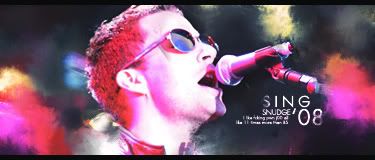
V2

V3

V4

V1: Full CMYK
V2: RGB
V3: Fcking uber secks colorz.
V4: Final version
PROTIP:
Never use CMYK unless you wanna print it. :>
Anyway, C'nC?
Re: Sing'08 - Sigwars
Posted: Tue Jan 29, 2008 9:20 pm
by CrimsonNuker
I like the text

Re: Sing'08 - Sigwars
Posted: Tue Jan 29, 2008 9:22 pm
by Snudge
CrimsonNuker wrote:I like the text
Ass. <3
Re: Sing'08 - Sigwars
Posted: Tue Jan 29, 2008 9:25 pm
by TwelveEleven
He looks stretched in an aweful way right now. But that could be my new 22" widescreen (No idea how to configure it on linux

) Switched to linux with my new 'PC' (running in a paperboard box right now
) the casing didn't arrive yet and everything else did, couldn't wait so I put it all in a paperboard box and I'm running it from within there right now!

Will rate after I fix my monitor settings
Re: Sing'08 - Sigwars
Posted: Tue Jan 29, 2008 9:27 pm
by Snudge
TwelveEleven wrote:He looks stretched in an aweful way right now. But that could be my new 22" widescreen (No idea how to configure it on linux
) Switched to linux with my new 'PC' (running in a paperboard box right now
) the casing didn't arrive yet and everything else did, couldn't wait so I put it all in a paperboard box and I'm running it from within there right now!
Will rate after I fix my monitor settings
Lol, OT much?
Anyway, yeah, it's your screen - I never EVER resize without shift

Re: Sing'08 - Sigwars
Posted: Tue Jan 29, 2008 9:28 pm
by cin
i love what you did with the color "overgangen" <- snuts, translate please <.<
but, tbh, i like the warm red of the cmyk version better than the red on the
normal one, idk. if you compare em to the warm colors of the cmyk, the normal
sig looks a bit dull. but that might just be because you put the two above
eachother so i can compare the colors so easily :]
i like your text, i like the borders. there is just one thing thats missing
imo. thats something, an effect or part stock or color whatevers, behind the
head. its hard to explain, but the head looks like its floating?
7,5/10 as it is now :]
and how come you put one on cmyk? you're going to print it? *_*
i found out the use of cmyk a little too late, was printing my business cards
and my bright orange had turned into dull orange when it came out of the
printer -.-
Re: Sing'08 - Sigwars
Posted: Tue Jan 29, 2008 9:32 pm
by aazumak
oh BS.... i swear i just typed out the comment.... whered it go?

regular > cmyk
the cmyk is way to over contrasted
but the regular is really good
and i also actually really like the text
one of my fav texts imo
i agree with cin about how something looks missing, but i really like and think its like a 9/10 or a 9.5/10
Re: Sing'08 - Sigwars
Posted: Tue Jan 29, 2008 9:33 pm
by Snudge
I accidentally put it on CMYK somehow ^^'
Anyway, I agree with you on the colours, Cin. Im going to try to fix em somehow. The RGB colours look VERY dull to me as well.
Oh, and overgang(en) = Transition(s) <3
Re: Sing'08 - Sigwars
Posted: Tue Jan 29, 2008 9:37 pm
by cin
ah. yes, transitions.
and as i said, i DO love the transitions, its just that they look dull compared to
the cmyk. im sure that i wouldnt even have mentioned it if that version wasnt right
above it ;]
Re: Sing'08 - Sigwars
Posted: Tue Jan 29, 2008 9:40 pm
by Snudge
New version added; did some depth working as well. Ill try to see what I can do about ze 'head problemz'
Re: Sing'08 - Sigwars
Posted: Tue Jan 29, 2008 9:42 pm
by cin
looks lot better now, much warmer colors.
and with "the head" you also mean adjusting the red on the head? ^_^
<3
Re: Sing'08 - Sigwars
Posted: Tue Jan 29, 2008 9:43 pm
by TwelveEleven
Love the colours, I'll rate it when I fix my monitor settings
Re: Sing'08 - Sigwars
Posted: Tue Jan 29, 2008 9:43 pm
by Snudge
cin wrote:looks lot better now, much warmer colors.
and with "the head" you also mean adjusting the red on the head? ^_^
<3
You think it's too red atm? :/
Anyway, I ment the part about you guys thinking its floating atm.
Re: Sing'08 - Sigwars
Posted: Tue Jan 29, 2008 10:18 pm
by cin
no, its not too red on the head ;]
i meant that the red on the head could be a little bit "warmer" imo,
like you did with the color clouds :]
Re: Sing'08 - Sigwars
Posted: Tue Jan 29, 2008 11:15 pm
by Faiien
not really digging the colors but thats just me
good sig
Re: Sing'08 - Sigwars
Posted: Wed Jan 30, 2008 9:16 am
by Millenium
I think I like V2 because the colors are a bit more toned down. The text is awesome, it looks like one of those texts on the Artist's official music albums
I would have preferred the "S" not being erased too much.
I think its a fantastic sig, I just think its missing something like WHAM that hits you. If I were you I'd try one of those swirly light lines around the microphone and make the mic & his mouth the focus.
Re: Sing'08 - Sigwars
Posted: Wed Jan 30, 2008 9:31 am
by BrokenSaint
Nice text lol. j00 pwn me?!?! mayne i pwn j00 more.
The head could use some light adjustment. Perhaps elaborate on the shadows a little and where the light is coming from. Kickass sig. I always wanted to learn how to smudge like the banner from Tech-GFX.
Re: Sing'08 - Sigwars
Posted: Wed Jan 30, 2008 11:30 am
by Snudge
BrokenSaint wrote:Nice text lol. j00 pwn me?!?! mayne i pwn j00 more.
The head could use some light adjustment. Perhaps elaborate on the shadows a little and where the light is coming from. Kickass sig. I always wanted to learn how to smudge like the banner from Tech-GFX.
That's some pro smudging I can't explain either

Edit;
Oh, and BS you're wrong about the textz <3

Teheee ^_^
Re: Sing'08 - Sigwars
Posted: Wed Jan 30, 2008 5:47 pm
by Doron
Is it just me, or is it lighter thenyesterday...
really.. it allmost blinded me, how pale that guy is..
Re: Sing'08 - Sigwars
Posted: Wed Jan 30, 2008 10:26 pm
by BrokenSaint
Snudge wrote:BrokenSaint wrote:Nice text lol. j00 pwn me?!?! mayne i pwn j00 more.
The head could use some light adjustment. Perhaps elaborate on the shadows a little and where the light is coming from. Kickass sig. I always wanted to learn how to smudge like the banner from Tech-GFX.
That's some pro smudging I can't explain either
Edit;
Oh, and BS you're wrong about the textz <3
Teheee ^_^
That's exactly how I read it lol
Re: Sing'08 - Sigwars
Posted: Wed Jan 30, 2008 10:47 pm
by aazumak
i like v2 alot more than v3
i like the dull text, the really white text in v3 ruins it for mw
Re: Sing'08 - Sigwars
Posted: Thu Jan 31, 2008 12:28 am
by Snudge
Version 4 added, final version.
Things changed:
Toned down colours a tad.
Fixed oversharpened text, also made it less white.
Made colours on head more vibrant.
Tried to adjust the shadows on his head a tad. Figured out that it's no use and left it like this.
Added sexy swirly thingy lines(Thanks for the tip, Milly <3)
Some overall dodge-/burn-tooling
Figured that if I would want to change the overall lightingto fix the lighting on the head, I'd have to completely redo the sig from scratch, which is a tad too much work for me seen how much I like it now :3.
Thanks everyone for commenting!
Re: Sing'08 - Sigwars
Posted: Thu Jan 31, 2008 12:44 am
by HOLLAstir

This is my critique, I tried to pin point certain areas liked/need improvement, so if you want to take it then feel free:
Blue Circled: Smudging is nice. I think the colors work well. Especially the one in the upper right is the one I like the most. The left and the lower right is nice as well. I think it stops a little short, but still looks nice.
Yellow Circle: I think it's slightly out of place. It looks a little awkward jetting out, and then having that black patch underneath empty. I would have filled out that space more and not made it so harsh. Maybe gone over it with a soft brush eraser at a light opacity to lighten it up it tad.
White Circle: To me, it looks very out of place. If you were to keep it, blur it out and smudge it into the bg more so it doesn't stick out so much.
Green Circle: I like the positioning of the text, although I think it's a little "blurry." It doesn't seem very clear, it just has a fuzzy appearance to it. I would go under windows > character and messed around with the height and length in there. Also, mess around with crisp, strong, etc.. see which one gives it a more crisp, clearer look.
The added mic effect looks nice, Although I think the soft brush dots around it is a little overdone. I also think his face is a little bright, could use some more burning. Overall, it's still a nice tag, could use some touch ups here and there though to really complete it.
Re: Sing'08 - Sigwars
Posted: Thu Jan 31, 2008 12:50 am
by Snudge

Lol, now I see where it's from.
Anyway I was too afraid of Farking up the head in the proces of fixing that, that I just left it there. It kinda looks like bunnyears though. I think it's cute. :3
Re: Sing'08 - Sigwars
Posted: Thu Jan 31, 2008 1:17 am
by aazumak
lol v4 ftw, gj
Re: Sing'08 - Sigwars
Posted: Thu Jan 31, 2008 11:21 am
by TwelveEleven
Don't like v4, it draws the attention away from him..