Page 1 of 1
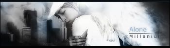
NSR - Alone ~ for sig wars week 4 [Fixed]
Posted: Tue Jan 22, 2008 11:53 pm
by Millenium
Final: fixed some spots, lightings, clipping masks, text. Was unable to smudge left =(
--------------------------------------------------
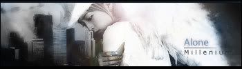
v2
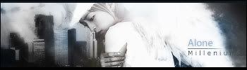
Its for the Sig Wars but I'd like some comments before submitting =)
Comments and construtive critiques appreciated!
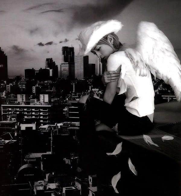
Original here:
http://i187.photobucket.com/albums/x5/m ... sorrow.jpg
Re: NSR - Alone
Posted: Tue Jan 22, 2008 11:59 pm
by aazumak
i think you did a very good job, i really like the text,
Re: NSR - Alone ~ for sig wars week 4
Posted: Wed Jan 23, 2008 1:51 am
by HOLLAstir
I agree, text is simple and isn't distracting, it fits. V2 Overall is more eye appealing to me, especially with that small brightness in the text. Although the lighting by her head it's a tad bit too bright, i'd tone it down. I would have liked to have seen a tad bit of smudging around the left side and what not as well. It was a really interesting stock, you did a good job with it milly.
Re: NSR - Alone ~ for sig wars week 4
Posted: Wed Jan 23, 2008 2:01 am
by Millenium
I'll smudge it around more.
I think I'm setting the layer blending mode wrong.
Re: NSR - Alone ~ for sig wars week 4
Posted: Wed Jan 23, 2008 2:02 am
by Aesthetic
yup. we looooose
Re: NSR - Alone ~ for sig wars week 4
Posted: Wed Jan 23, 2008 2:02 am
by Faiien
it looks great but i think you could use a little bit more blending on the right side, dont erally like it cause its completely white. Mayb tone it down a little?
Re: NSR - Alone ~ for sig wars week 4
Posted: Wed Jan 23, 2008 2:25 am
by CrimsonNuker
why yuu change your name milly? >_<
Re: NSR - Alone ~ for sig wars week 4
Posted: Wed Jan 23, 2008 2:26 am
by Millenium
I think I need to erase some parts and fine tune it with the lighting when I go home.
Posted: Wed Jan 23, 2008 7:33 am
by cin
i love the txt, and i'm a sucker for movie borders T_T
however, imo the white behind your person is a bit too much.
thats just because the person wears a white shirt, which makes
it hard to see "where the shirt stops and the white begins".
i'd tone it down a little, close to the shirt.
anywho, looks good. you're getting better and better.
<3
Re: NSR - Alone ~ for sig wars week 4
Posted: Wed Jan 23, 2008 8:07 am
by magisuns
dam they both look good... v2 is much better imo
Re: NSR - Alone ~ for sig wars week 4
Posted: Wed Jan 23, 2008 10:20 am
by Priam
Looks brilliant, i like the vibe.
She looks like Colbie Callait btw :/
Re: NSR - Alone ~ for sig wars week 4
Posted: Wed Jan 23, 2008 5:36 pm
by TwelveEleven
Looks like I got some competition..
Re: NSR - Alone ~ for sig wars week 4
Posted: Wed Jan 23, 2008 7:17 pm
by Millenium
TwelveEleven wrote:Looks like I got some competition..
I told you we're all here to stop you from being the sig master

Re: NSR - Alone ~ for sig wars week 4
Posted: Thu Jan 24, 2008 3:24 am
by fena
Yah! I love this one, Milly! :] Every single tag you post, you get better and better.
As a quick critique, I think that your tag is a little too bright - especially V2. Whether intentional or not, I didn't know that the streak of white were actually wings until I took a look at the stock. If you sought to disguise the wings and turn them into that streak of light, then it was a job very well done. If not, then I think it'd be best if you toned down the light just a little bit. I love the wings, and right now they're kind of being blinded by the brilliant light. That's just my humble opinion.
Your text, font, and color is just lovely. There isn't a thing I'd change about it. Love, love, love.
And just one last thing that I loved compared to your previous tags is the size of it. Whether you'll be keeping to this size from now on, I just want you to know that I love the size is all. xP
Re: NSR - Alone ~ for sig wars week 4
Posted: Thu Jan 24, 2008 7:50 am
by Millenium
fena wrote:Yah! I love this one, Milly! :] Every single tag you post, you get better and better.
As a quick critique, I think that your tag is a little too bright - especially V2. Whether intentional or not, I didn't know that the streak of white were actually wings until I took a look at the stock. If you sought to disguise the wings and turn them into that streak of light, then it was a job very well done. If not, then I think it'd be best if you toned down the light just a little bit. I love the wings, and right now they're kind of being blinded by the brilliant light. That's just my humble opinion.
Your text, font, and color is just lovely. There isn't a thing I'd change about it. Love, love, love.
And just one last thing that I loved compared to your previous tags is the size of it. Whether you'll be keeping to this size from now on, I just want you to know that I love the size is all. xP
At least ONE person understands not bigger the better

Lul.
Well the last sig I made it big on purpose because there was a lot to fit. There was Tan Wei looking back, her reflection in the mirrors, and flowers and sh1t. The previous one to that, peace, one had a specified size.
I personally love this size though, and honestly I love it beacuse HOLLA does it so well in that size.
Re: NSR - Alone ~ for sig wars week 4
Posted: Thu Jan 24, 2008 11:52 am
by Azn_Pride
i'm really lovin the v2
v1, not liking so much

didn't like the text in v1 though.was kinda big >_< i like the text in v2 though

Re: NSR - Alone ~ for sig wars week 4 [Fixed]
Posted: Thu Jan 24, 2008 3:02 pm
by Millenium
Fixed some issues.
I smudged left some more but I don't know what blending mode to set to for it to show >.> My noobness takes me nowhere.
Re: NSR - Alone ~ for sig wars week 4 [Fixed]
Posted: Thu Jan 24, 2008 11:37 pm
by Faiien
i cant really see what you fixed

mayb took out the pinkish lighting?
but if you were going for the angel wing effect it worked
Re: NSR - Alone ~ for sig wars week 4 [Fixed]
Posted: Fri Jan 25, 2008 1:33 am
by Pilot
Unless the girl in the sig is yourself or someone you are a fan of, I'd take it out. I really dislike it when people put pictures of people who are complete strangers-but thats just me. Even if theyre good-lookin they're not worthy enough to put in YOUR sig, and then again, that just my preference. If you took the girl out and photoshoped just that cityscape behind you, 10/10
Re: NSR - Alone ~ for sig wars week 4 [Fixed]
Posted: Fri Jan 25, 2008 1:58 am
by Millenium
Pilot wrote:Unless the girl in the sig is yourself or someone you are a fan of, I'd take it out. I really dislike it when people put pictures of people who are complete strangers-but thats just me. Even if theyre good-lookin they're not worthy enough to put in YOUR sig, and then again, that just my preference. If you took the girl out and photoshoped just that cityscape behind you, 10/10
Edit:
The girl is Hamasaki Ayumi. The picture is a promotion thing from Endless Sorrow, one of her albums. Her songs aren't exactly my favorite but I have few that I really like. I don't go for random celebrities or other people.