--------------------------------------------------

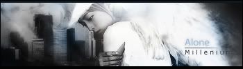
v2

Its for the Sig Wars but I'd like some comments before submitting =)
Comments and construtive critiques appreciated!
Original here:
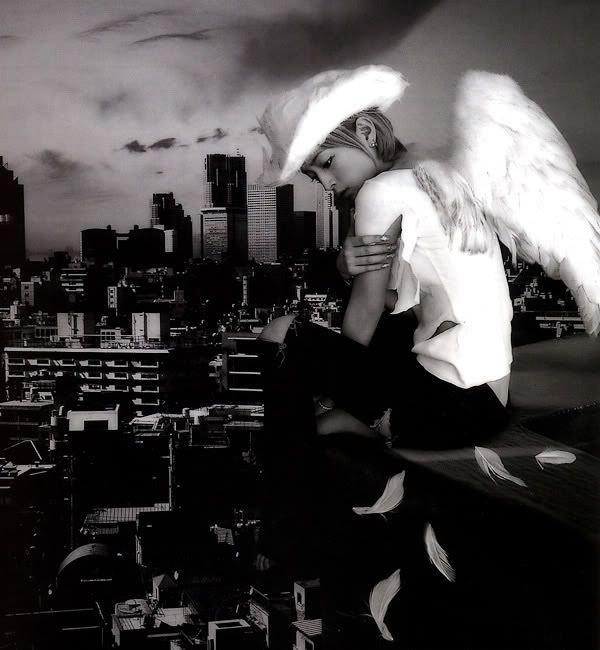
http://i187.photobucket.com/albums/x5/m ... sorrow.jpg


TwelveEleven wrote:Looks like I got some competition..
fena wrote:Yah! I love this one, Milly! :] Every single tag you post, you get better and better.
As a quick critique, I think that your tag is a little too bright - especially V2. Whether intentional or not, I didn't know that the streak of white were actually wings until I took a look at the stock. If you sought to disguise the wings and turn them into that streak of light, then it was a job very well done. If not, then I think it'd be best if you toned down the light just a little bit. I love the wings, and right now they're kind of being blinded by the brilliant light. That's just my humble opinion.
Your text, font, and color is just lovely. There isn't a thing I'd change about it. Love, love, love.
And just one last thing that I loved compared to your previous tags is the size of it. Whether you'll be keeping to this size from now on, I just want you to know that I love the size is all. xP


 [uBp_Knights * HaryPotrWall]
 Pilot wrote:Unless the girl in the sig is yourself or someone you are a fan of, I'd take it out. I really dislike it when people put pictures of people who are complete strangers-but thats just me. Even if theyre good-lookin they're not worthy enough to put in YOUR sig, and then again, that just my preference. If you took the girl out and photoshoped just that cityscape behind you, 10/10


