Page 1 of 1
Newwwww sig =)
Posted: Sun Jan 20, 2008 12:25 am
by AkillerNXC
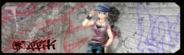
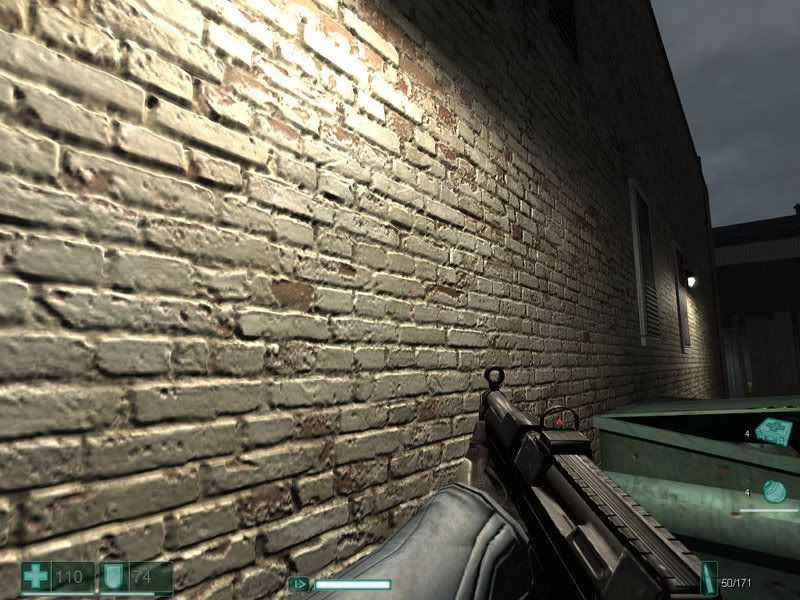
Critique please. =) For the brick wall I used
thisscreenshot...I don't think it turned out to bad, but yeah, idk lol.
One thing that bothers me a little bit is the border isn't the best, the left and right side aren't the same width... =/
Re: Newwwww sig =)
Posted: Sun Jan 20, 2008 12:33 am
by Aesthetic
lol nice
Re: Newwwww sig =)
Posted: Sun Jan 20, 2008 1:12 am
by Faiien
pretty cool
i like the street
Re: Newwwww sig =)
Posted: Sun Jan 20, 2008 1:16 am
by HOLLAstir
As for your border issue. Just make a new layer above everything. Push ctrl+a. Then go to Edit>>Stroke>> Make it around 3px and do "center."
Re: Newwwww sig =)
Posted: Sun Jan 20, 2008 1:43 am
by Aesthetic
HOLLAstir wrote:As for your border issue. Just make a new layer above everything. Push ctrl+a. Then go to Edit>>Stroke>> Make it around 3px and do "center."
i can't believe i didn't think of that.

Re: Newwwww sig =)
Posted: Sun Jan 20, 2008 4:04 pm
by aazumak
HOLLAstir wrote:As for your border issue. Just make a new layer above everything. Push ctrl+a. Then go to Edit>>Stroke>> Make it around 3px and do "center."
agree with ^^
it looks good but its kinda plain, the fact that you used the wall was nice, but the person is just sitting there. you need some kind of "effect" something happening, something to make people look and go ooooh and awwww
Re: Newwwww sig =)
Posted: Sun Jan 20, 2008 7:12 pm
by AkillerNXC
Yeah...I could've sworn I saved it before I flattened it but apparantly I didn't so I can't do anything with it. Ughhhhh
And yeah aazumak, I didn't want to add to much because for this one I wanted it to be pretty simple...
EDIT:
Remade from scratch, I dont think its as good as the first one and I changed the text to my name, but the border looks better =P and I made sure I saved it before flattening lol XD
