Digital art design, renderings, signatures and anything art related. Upload pictures of your newest work or ask for feedback. Post graphics requests or discuss art in general.
Snudge
Senior Member
Posts: 4200 Joined: Sun Jun 11, 2006 8:20 pmQuick Reply: YesLocation: Artist Corner
Contact:
Post
by Snudge Sat Jan 19, 2008 7:47 pm
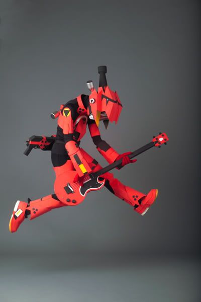
V1
V2
BW:
BW V2:
V3:
Yeah, its been a while, so Im just doing tuts
EDIT:
V2 and a BW added. Figured V1->V2 could be a little darker.
Last edited by
Snudge on Sat Jan 19, 2008 8:27 pm, edited 2 times in total.
mmellu
Active Member
Posts: 837 Joined: Sat May 05, 2007 3:23 pmQuick Reply: YesLocation: Off Topic
Contact:
Post
by mmellu Sat Jan 19, 2008 7:50 pm
Its nice
i like it.
<<banned from SRF for proof of botting. -SG>>
cin
Post
by cin Sat Jan 19, 2008 7:51 pm
definitely not a bad sig, but too chaotic for my taste.maybe a border would make it less restless.
Snudge
Senior Member
Posts: 4200 Joined: Sun Jun 11, 2006 8:20 pmQuick Reply: YesLocation: Artist Corner
Contact:
Post
by Snudge Sat Jan 19, 2008 7:58 pm
Hmm, yeah, border. Ill see.
<<banned from SRF for proof of botting. -SG>>
deep.in
Advanced Member
Posts: 2133 Joined: Mon Mar 19, 2007 11:55 amQuick Reply: YesLocation: .........
Contact:
Post
by deep.in Sat Jan 19, 2008 8:04 pm
I love that black/white version
And when it's flipped horizontally, as you have in your sig area. Maybe it need some colors, but just a lil bit vissible, ah i dont know how to explain it correctly, but i love this sig
<<banned from SRF for bot admission. -SG>>
Snudge
Senior Member
Posts: 4200 Joined: Sun Jun 11, 2006 8:20 pmQuick Reply: YesLocation: Artist Corner
Contact:
Post
by Snudge Sat Jan 19, 2008 8:06 pm
deep.in wrote: I love that black/white version
And when it's flipped horizontally, as you have in your sig area. Maybe it need some colors, but just a lil bit vissible, ah i dont know how to explain it correctly, but i love this sig
NO
NO
NO
NO
IM
NOT going to pick one colour, or spot and colour it/let it show, dammit. '>>
<3?
<<banned from SRF for proof of botting. -SG>>
deep.in
Advanced Member
Posts: 2133 Joined: Mon Mar 19, 2007 11:55 amQuick Reply: YesLocation: .........
Contact:
Post
by deep.in Sat Jan 19, 2008 8:12 pm
Ok, i just suggested
<<banned from SRF for bot admission. -SG>>
Snudge
Senior Member
Posts: 4200 Joined: Sun Jun 11, 2006 8:20 pmQuick Reply: YesLocation: Artist Corner
Contact:
Post
by Snudge Sat Jan 19, 2008 8:21 pm
deep.in wrote: Ok, i just suggested
Dont feel offended
/hug
EDIT:
Added 2 new versions, the ones with border
Seems like I only did the horizontal flipped ones though.
Ah well, cba to do more atm.
<<banned from SRF for proof of botting. -SG>>
HOLLAstir
Loyal Member
Posts: 1637 Joined: Tue Aug 28, 2007 7:17 pmQuick Reply: YesLocation: 206
Contact:
Post
by HOLLAstir Sat Jan 19, 2008 8:34 pm
I'm always a sucker for B&W sigs. So you already know i'm pickin B&W V2. I like it, but the light source at the top is a little harsh, I would tone it down a tad.
N1TROX
Valued Member
Posts: 354 Joined: Wed Oct 18, 2006 10:38 amQuick Reply: YesLocation: Artist Corner
Post
by N1TROX Sat Jan 19, 2008 9:07 pm
I agree with holla, BW V2 is really nice, i like it alot.
Luoma
Veteran Member
Posts: 3895 Joined: Thu Sep 14, 2006 8:23 amQuick Reply: YesLocation: Artists Corner & Aege
Post
by Luoma Sat Jan 19, 2008 9:09 pm
V3 is lookin' good =D
<<banned from SRF for proof of botting. -SG>>
Snudge
Senior Member
Posts: 4200 Joined: Sun Jun 11, 2006 8:20 pmQuick Reply: YesLocation: Artist Corner
Contact:
Post
by Snudge Sat Jan 19, 2008 9:36 pm
As for the text, I had to do something . Untill I learn how to protect sigs from being ripped while not in a .psd format, I will try to incorporate my nickname somewhere in the sig. Initially the 'S' in the clipping mask box was just supposed to be my text, but it's easily rippable by anyone who has a nick that starts with an s(Yes, I'm a tad paranoid :]).
<<banned from SRF for proof of botting. -SG>>
Faiien
Active Member
Posts: 889 Joined: Sun Oct 28, 2007 5:10 pmQuick Reply: YesLocation: Artist Corner
Post
by Faiien Sat Jan 19, 2008 9:58 pm
love it
Snudge
Senior Member
Posts: 4200 Joined: Sun Jun 11, 2006 8:20 pmQuick Reply: YesLocation: Artist Corner
Contact:
Post
by Snudge Sat Jan 19, 2008 10:00 pm
Faiien wrote: love it
Thanks but err... It ain't abstract, rofl.
<<banned from SRF for proof of botting. -SG>>
Faiien
Active Member
Posts: 889 Joined: Sun Oct 28, 2007 5:10 pmQuick Reply: YesLocation: Artist Corner
Post
by Faiien Sat Jan 19, 2008 10:01 pm
oh gosh...is that a good thing or a bad thing...lol
Panu
Veteran Member
Posts: 3536 Joined: Mon Aug 27, 2007 8:43 pmQuick Reply: YesLocation: Around
Post
by Panu Sat Jan 19, 2008 10:01 pm
wat is it
Snudge
Senior Member
Posts: 4200 Joined: Sun Jun 11, 2006 8:20 pmQuick Reply: YesLocation: Artist Corner
Contact:
Post
by Snudge Sat Jan 19, 2008 10:02 pm
xD
<<banned from SRF for proof of botting. -SG>>
Swindler
Forum God
Posts: 11256 Joined: Tue Apr 10, 2007 7:49 amQuick Reply: YesLocation: Pimpas Paradise.
Post
by Swindler Sat Jan 19, 2008 11:04 pm
Snudge wrote: xD
i thought it was a train or something lawl
TwelveEleven
Veteran Member
Posts: 3806 Joined: Sat Mar 17, 2007 1:11 amQuick Reply: YesLocation: Heaven
Contact:
Post
by TwelveEleven Sat Jan 19, 2008 11:09 pm
Didn't expect it to be something like that lol. Well nice sig, chaotic but I like it
<<banned from SRF for proof of botting. -SG>>
Faiien
Active Member
Posts: 889 Joined: Sun Oct 28, 2007 5:10 pmQuick Reply: YesLocation: Artist Corner
Post
by Faiien Sat Jan 19, 2008 11:22 pm
come on people
Panu
Veteran Member
Posts: 3536 Joined: Mon Aug 27, 2007 8:43 pmQuick Reply: YesLocation: Around
Post
by Panu Sat Jan 19, 2008 11:32 pm
Snudge wrote: xD
lol at first i thought it was that red pokemon
Luoma
Veteran Member
Posts: 3895 Joined: Thu Sep 14, 2006 8:23 amQuick Reply: YesLocation: Artists Corner & Aege
Post
by Luoma Sun Jan 20, 2008 12:03 am
Cool stock
Faiien wrote: come on people
I also thought it was abstract
<<banned from SRF for proof of botting. -SG>>
Snudge
Senior Member
Posts: 4200 Joined: Sun Jun 11, 2006 8:20 pmQuick Reply: YesLocation: Artist Corner
Contact:
Post
by Snudge Sun Jan 20, 2008 12:16 am
BS probably recognizes the stock.
<<banned from SRF for proof of botting. -SG>>
BrokenSaint
Veteran Member
Posts: 3473 Joined: Sun Jan 01, 2006 8:49 pmQuick Reply: YesLocation: Stuntin'.
Contact:
Post
by BrokenSaint Sun Jan 20, 2008 3:10 am
Hell fricken yeah I do. FLCL FTW!!!
9/10
Faiien
Active Member
Posts: 889 Joined: Sun Oct 28, 2007 5:10 pmQuick Reply: YesLocation: Artist Corner
Post
by Faiien Sun Jan 20, 2008 3:17 am
is that from FLCL?
BrokenSaint
Veteran Member
Posts: 3473 Joined: Sun Jan 01, 2006 8:49 pmQuick Reply: YesLocation: Stuntin'.
Contact:
Post
by BrokenSaint Sun Jan 20, 2008 4:21 am
Hershey wrote: FLCL was 1 of the few tv shows i fell in love with. i wanted more after it ended
Fo sho'. 6 episodes ain't enough! T_T
I still got all the episodes in my computer. I watch em every now and then.
gamef
Advanced Member
Posts: 2290 Joined: Fri Dec 01, 2006 10:04 pmQuick Reply: YesLocation: London
Post
by gamef Sun Jan 20, 2008 1:29 pm
I think thats awesome loving the feel to it all chaotic and stuff.
Playing League of Legends. Free RTS game click
here to sign up.
aazumak
Active Member
Posts: 918 Joined: Sat Jun 09, 2007 12:56 pmQuick Reply: YesLocation: Artist Corner
Contact:
Post
by aazumak Sun Jan 20, 2008 3:59 pm
the last 1, the one where its coming from the left looks great imo
and great job smudging
i love the blank space in it, it makes it awesome, your best sig, the text is ok, but could be better.
it looks amazing though, great job


And when it's flipped horizontally, as you have in your sig area. Maybe it need some colors, but just a lil bit vissible, ah i dont know how to explain it correctly, but i love this sig