Page 1 of 1
I Made Sig.
Posted: Sun Jan 06, 2008 3:53 pm
by mmellu

+ 2 other color. >.<

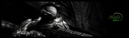
Ya the text dont see well. imma bad maker. And my paintshop pro 9 dont work well :b
(I know they sux. They are like my first sigs. )

-----------------------------------------------------------------
Okei i dont know what i did but something i did. i dont know what to write. that text sux. -.- i cant make it smaller. if i try it go too small someone can fix it if wanna. .__.
Posted: Sun Jan 06, 2008 3:59 pm
by cin
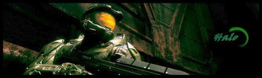
i likes first one.
put in lightsource and change txt.
you might want to make the bg more exciting too, bit emtpy atm.
6.5/10
Posted: Sun Jan 06, 2008 4:01 pm
by mmellu
cin wrote:i likes first one.
put in lightsource and change txt.
you might want to make the bg more exciting too, bit emtpy atm.
6.5/10
I gonna do that tomorrow. ^^
Posted: Sun Jan 06, 2008 4:03 pm
by cin
just to give you a little tip before you start,
if you look at the lighting on the render, you see the light source should be
somewhere in the top-right of the sig
;]
Posted: Sun Jan 06, 2008 7:04 pm
by Caras
TO BIG!!!!1!
Posted: Sun Jan 06, 2008 7:33 pm
by TwelveEleven
Caras wrote:TO BIG!!!!1!
ze size is a killer oui oui
Posted: Sun Jan 06, 2008 7:36 pm
by cin
TwelveEleven wrote:Caras wrote:TO BIG!!!!1!
ze size is a killer oui oui
size doesnt matter

Posted: Sun Jan 06, 2008 7:40 pm
by TwelveEleven
cin wrote:TwelveEleven wrote:Caras wrote:TO BIG!!!!1!
ze size is a killer oui oui
size doesnt matter
well then it's too thick

Posted: Sun Jan 06, 2008 7:43 pm
by cin
TwelveEleven wrote:cin wrote:TwelveEleven wrote:Caras wrote:TO BIG!!!!1!
ze size is a killer oui oui
size doesnt matter
well then it's too thick
or the sig space is too tight T_T
Posted: Sun Jan 06, 2008 8:03 pm
by magisuns
I like your siggy buh... its so dark ._. change up the lighting a bit