Page 1 of 1
nsr-think
Posted: Wed Jan 02, 2008 3:11 pm
by Faiien

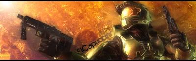
made it this morning, tried some new techniques by glancing at a tutorial
c&c
kthxbye

Posted: Wed Jan 02, 2008 8:00 pm
by 0l3n
Looks great to me its just missing depth, blur some parts of the sig.
Posted: Wed Jan 02, 2008 8:21 pm
by Faiien
thx 0l3n
ive blured some parts but i accidentally covered it with another layer

Posted: Wed Jan 02, 2008 8:36 pm
by HOLLAstir
Yeah I agree missing some depth. He seems to pop out at me a little, so could use a little bit more blending in. Other then that it looks good.
Posted: Wed Jan 02, 2008 8:57 pm
by Faiien
got it, more blending next time
Posted: Wed Jan 02, 2008 10:26 pm
by BrokenSaint
I don't like text along paths.
Posted: Wed Jan 02, 2008 10:29 pm
by cin
BrokenSaint wrote:I don't like text along paths.
me neither.. except in this one by elcapuccino. still <3 his sigs.
Posted: Wed Jan 02, 2008 10:58 pm
by Faiien
so should i set them in more of a nonlinear space?
Posted: Thu Jan 03, 2008 1:09 am
by HOLLAstir
Generally, I don't like text along paths either. But for this one It's not TOO bad. I would like to see it vertical rather then along a path.
Posted: Thu Jan 03, 2008 1:44 am
by Faiien
i was trying to pull a double wammy with this one by making the text add flow and fitting in
Posted: Thu Jan 03, 2008 9:19 pm
by christina
I like it, and i also agree needs depth.
8/10.
P.S. Holla get on msn