Digital art design, renderings, signatures and anything art related. Upload pictures of your newest work or ask for feedback. Post graphics requests or discuss art in general.
Faiien
Active Member
Posts: 889 Joined: Sun Oct 28, 2007 5:10 pmQuick Reply: YesLocation: Artist Corner
Post
by Faiien Wed Jan 02, 2008 3:11 pm
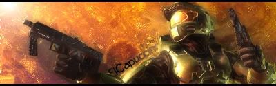
made it this morning, tried some new techniques by glancing at a tutorial
c&c
kthxbye
0l3n
Elite Member
Posts: 5184 Joined: Fri Jun 16, 2006 1:45 pmQuick Reply: YesLocation: Artists Corner
Post
by 0l3n Wed Jan 02, 2008 8:00 pm
Looks great to me its just missing depth, blur some parts of the sig.
Faiien
Active Member
Posts: 889 Joined: Sun Oct 28, 2007 5:10 pmQuick Reply: YesLocation: Artist Corner
Post
by Faiien Wed Jan 02, 2008 8:21 pm
thx 0l3n
ive blured some parts but i accidentally covered it with another layer
HOLLAstir
Loyal Member
Posts: 1637 Joined: Tue Aug 28, 2007 7:17 pmQuick Reply: YesLocation: 206
Contact:
Post
by HOLLAstir Wed Jan 02, 2008 8:36 pm
Yeah I agree missing some depth. He seems to pop out at me a little, so could use a little bit more blending in. Other then that it looks good.
Faiien
Active Member
Posts: 889 Joined: Sun Oct 28, 2007 5:10 pmQuick Reply: YesLocation: Artist Corner
Post
by Faiien Wed Jan 02, 2008 8:57 pm
got it, more blending next time
BrokenSaint
Veteran Member
Posts: 3473 Joined: Sun Jan 01, 2006 8:49 pmQuick Reply: YesLocation: Stuntin'.
Contact:
Post
by BrokenSaint Wed Jan 02, 2008 10:26 pm
I don't like text along paths.
cin
Post
by cin Wed Jan 02, 2008 10:29 pm
BrokenSaint wrote: I don't like text along paths.
me neither.. except in this one by elcapuccino. still <3 his sigs.
Faiien
Active Member
Posts: 889 Joined: Sun Oct 28, 2007 5:10 pmQuick Reply: YesLocation: Artist Corner
Post
by Faiien Wed Jan 02, 2008 10:58 pm
so should i set them in more of a nonlinear space?
HOLLAstir
Loyal Member
Posts: 1637 Joined: Tue Aug 28, 2007 7:17 pmQuick Reply: YesLocation: 206
Contact:
Post
by HOLLAstir Thu Jan 03, 2008 1:09 am
Generally, I don't like text along paths either. But for this one It's not TOO bad. I would like to see it vertical rather then along a path.
Faiien
Active Member
Posts: 889 Joined: Sun Oct 28, 2007 5:10 pmQuick Reply: YesLocation: Artist Corner
Post
by Faiien Thu Jan 03, 2008 1:44 am
i was trying to pull a double wammy with this one by making the text add flow and fitting in
christina
Frequent Member
Posts: 1017 Joined: Sun Oct 07, 2007 6:58 pmQuick Reply: YesLocation: Artist Corner
Post
by christina Thu Jan 03, 2008 9:19 pm
I like it, and i also agree needs depth.
<<Left because of dumbshit people like stallowned>>