Page 1 of 1
nsr"waithwatmariosuperspeedy?! :O
Posted: Tue Dec 25, 2007 9:09 pm
by Snudge
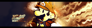
V1 Colour:
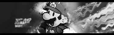
V2 B&W:
Cnc?
Posted: Tue Dec 25, 2007 10:12 pm
by Faiien
lol...
sorry nc

Posted: Tue Dec 25, 2007 11:12 pm
by HOLLAstir
Flow is there, but I feel like the distorted wave and ripple effect is just a little over used. Color version is better. Bad text. Mario is a G though. Anyways, it's just so-so to me <3
Posted: Wed Dec 26, 2007 11:16 am
by 0l3n
Text looks great, flow and lighting are good to but to me it feels slightly monotone. The ripple effect is somewhat overdone like Holla said and you might want to try brushing a little black in the right hand corners (just a little).
Last thing would be to maybe blur some of the rippled lines to add to the depth.
Posted: Sun Dec 30, 2007 7:01 pm
by WaX
Think i missed this thread, Really like the sig, agree with whats been said bout the ripples, love the text & colours and overall think it looks great.