Page 1 of 1
notthelight - nsr : random - nsr
Posted: Fri Dec 21, 2007 11:29 pm
by Snudge
Nowhere near my old standards imo.

Yeah, pretty much random.
Posted: Sat Dec 22, 2007 7:42 am
by Panu
i like both, i really like the random one, its random lol
Posted: Sat Dec 22, 2007 3:05 pm
by CrimsonNuker
Random is what makes a sig unique right?

Re: notthelight - nsr : random - nsr
Posted: Sat Dec 22, 2007 3:14 pm
by Rizla
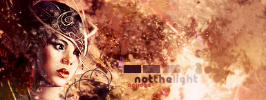
the effects taking place to the right of her head and above the text seem redundant and lacking the spice the rest of the image throws out at me. Though at second glance, due to the popping nature of the tag you wouldn't want any overbearing effects there...especially because her focus is directed to where you want us to look. (queue the applause for excellent overall visual flow)
I would bring "light" up just a smidge (like 3%), other than that I'm digging the text.
I would balance out and perhaps darken the areas slightly around the light, this would make the light pop out more and balance the piece as it pertains to alpha level.
Overall a very solid piece that with a couple tweaks could be phenomenal. I would love to see a killer LP with the same theme from you. 8.5/10
Rather bland, feels like fluff - no direction, poor visual flow. 5/10
Posted: Sun Dec 23, 2007 12:02 am
by Snudge
Criticism, RIZLA!

Yeah, the 'random' one is kinda plain, I know. But I felt like shit while photoshopping and didnt really have my mind on it. >>
I'll see what I can do with the other sig :>