Page 1 of 1
NSR
Posted: Mon Dec 17, 2007 6:26 pm
by Millenium
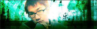
I don't know what the heck is wrong with me. This is my third time touching PS and making something out of it, but I mean it doesn't look right. The guy, who's my RL friend, since I don't like using celeb/random renders, doesn't seem to fit in at all with teh background (at least thats what I've been told)
So please rate/comment/(say I suck)
=)
Posted: Mon Dec 17, 2007 7:10 pm
by 0l3n
Id say lower the contrast but thats about it, it looks pretty.

Posted: Mon Dec 17, 2007 8:58 pm
by Millenium
0l3n wrote:Id say lower the contrast but thats about it, it looks pretty.
Aw <3 thank you, anything criticisms?
Posted: Mon Dec 17, 2007 9:02 pm
by cin
looks good milly.
the guy just blends in a bit too much for my taste.
i mean, the sides are too dark compared to the focal.
other than that, 7.5/10
Posted: Mon Dec 17, 2007 9:28 pm
by Luoma
I wish the whole thing was more sharp and the bottom flowed abit more with the rest.
But hey looks good
Posted: Mon Dec 17, 2007 10:01 pm
by Millenium
cin wrote:the guy just blends in a bit too much for my taste.
And I thought I did a bad job blending =\
Or more like I didn't really know how to blend him the better way more suitable...
Luoma wrote:I wish the whole thing was more sharp and the bottom flowed abit more with the rest.
I have to agree the bottom is a bit screwed up.
I screwed up the order I did the layers so the rectangular tool (the bar at the bottom) didn't come on top of him like I planned) Oh such noobishness <3
And after I messed with the lighting the quality of his hair seems to be suffering and I don't know how to fix T_T
Posted: Mon Dec 17, 2007 11:25 pm
by Faiien
i like it ^^
just lower the contrast in the background and make it less grainy
