Page 1 of 1
NSR~ War. woooooooooooooooo
Posted: Fri Dec 07, 2007 5:55 pm
by _UnKnOwN
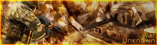
Again, another new sig - please rate and give constructive feedback

thanks

-------------------------
Posted: Fri Dec 07, 2007 11:45 pm
by Millenium
6/10 from me. I like your last sig better.
- I don't like the light border, it makes the sig unfocused imo...
- The render doesn't stick out
- In general it doesn't seem to have a focus.
Posted: Fri Dec 07, 2007 11:58 pm
by WaX
yup^ No real clear focal, it just all seems to merge together which isnt bad in all cases it's just i had to look a couple of times to see whats goin on. But on the whole not bad at all. (^.^)
Posted: Sat Dec 08, 2007 3:23 am
by SuicideGrl
there's no depth. soldier needs to be CLEARLY in the foreground, tank CLEARLY in the background. there's more effect than there is focal. it's hard to discern the focal at all at first, as the above said.
use blurring to create depth. or use layers between the two focal elements (soldier and tank) to simulate the distance between the two.
maybe try sharpening the focal(s)? they just kinda blend into the bg for me.
Posted: Sat Dec 08, 2007 10:47 am
by rek
Two focals = Bad
Posted: Sat Dec 08, 2007 1:05 pm
by durkadurka
i know im not shit to be posting my opinion on it, but it looks like theres too much going on, with no 1 thing to look at... a bit smushed together. hope that helps <o.O>