Page 1 of 1
Made Some Stuff
Posted: Tue Nov 20, 2007 12:43 am
by GrimJow
Posted: Tue Nov 20, 2007 12:50 am
by Aby
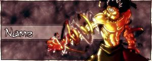
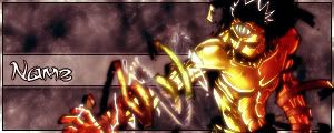
Neither is best, you shouldn't cut off caricatures that are extruding from the sig.
You have to fix up the 1st sig, it by far has the best potential.
Posted: Tue Nov 20, 2007 12:53 am
by GrimJow
alright thanks ill see if i can move the render or make it smaller...ill think of something

Posted: Tue Nov 20, 2007 2:23 pm
by 0l3n
I dont really like the first coupple of sigs ( the pop out ones) but the rest are quite good.
Posted: Tue Nov 20, 2007 6:10 pm
by binnosh
i prefer the very last one

Posted: Tue Nov 20, 2007 6:54 pm
by GrimJow
0l3n wrote:I dont really like the first coupple of sigs ( the pop out ones) but the rest are quite good.
awe and i thought the pop out ones were so good too

hah maybe ill make a new version of them thats not pop out
binnosh wrote:i prefer the very last one
glad you liked my user tags
Posted: Tue Nov 20, 2007 7:06 pm
by binnosh
just a question bout the last one, is the render it's self soo blurry?
i like shapr renders myself, and i think it might look better a bit sharpened
Posted: Tue Nov 20, 2007 7:52 pm
by aazumak
i feel that if the 4th one, the gundam on e was less blurry and brighter, that would be the best
and as said before, pop out sigs shouldn't be cut off whatsoever
Posted: Wed Nov 21, 2007 6:43 pm
by GrimJow
binnosh wrote:just a question bout the last one, is the render it's self soo blurry?
i like shapr renders myself, and i think it might look better a bit sharpened
oh haha i thought you were talking about the usertags...not the three to choose from

but if you mean blurry as in it looks like it was feathered then yeah it came that way...i spent like 45 minutes trying to make it blend it with the sig...yellow and blue do not mix >.>
http://i7.tinypic.com/6x0cl01.pngaazumak wrote:i feel that if the 4th one, the gundam on e was less blurry and brighter, that would be the best
and as said before, pop out sigs shouldn't be cut off whatsoever
yeah that one was like my third atempt at smudging...im seriously bad at it...but thanks ill see what i can do


