Page 1 of 1
NSR ~ Metroid
Posted: Mon Nov 19, 2007 2:53 pm
by binnosh
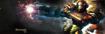
comments please

Posted: Mon Nov 19, 2007 3:33 pm
by cin
not bad. i just never really a fan of lens flares

Posted: Mon Nov 19, 2007 3:38 pm
by binnosh
hehe, was browsing trough some tuts and saw someone do it to a metroid sig aswell, and it seemed kinda cool

tought i'd try it aswell
Posted: Mon Nov 19, 2007 3:38 pm
by Deacon
I love it
But yeah a child hand is filled fast haha ^^ ( Dont take that to serious xD )
Posted: Mon Nov 19, 2007 4:05 pm
by SuicideGrl
lighting is nice, but it's a little flat. needs more depth. <3 metroid btw.
Posted: Mon Nov 19, 2007 4:10 pm
by binnosh
euhm :p
how can i get more depth in it :p
Posted: Mon Nov 19, 2007 5:23 pm
by LadyOphelia
I like the lens flare. Very nice sig you made there
Posted: Mon Nov 19, 2007 6:16 pm
by Snudge
Lens Flare = nono, as Rizla would say.
And to me as well, because you have 2 lightsources now. >>
Posted: Mon Nov 19, 2007 6:22 pm
by binnosh
should have edited a bit more so it wouldn't look like a lens flare
but meh, i'm quite pleased with the result, this is acually the first time i make a rather decent sig
i'll make sure it won't happen again
Posted: Mon Nov 19, 2007 7:33 pm
by 0l3n
binnosh wrote:euhm :p
how can i get more depth in it :p
Blur and sharpen tool.
Posted: Mon Nov 19, 2007 10:18 pm
by BrokenSaint
Ah, you must've seen the tut I showed christina. Very cool, but dont make the lens flare obvious. The text placement needs work. I would place it near the focal point and nowhere near the edges of the sig.
BTW, METROID FOR THE FACKING WIN
Posted: Mon Nov 19, 2007 10:34 pm
by aazumak
looks wondering, the background is greatm it just seems to be popping out to much to me, make the bottom part blended in and then itll be awsome imo, text isnt bad but isnt great
Posted: Mon Nov 19, 2007 11:19 pm
by binnosh
hehe cheers guys, i'll certainly watch for tehse things when i'm making a new one :p