Page 1 of 1
NSR - The Professional
Posted: Tue Nov 13, 2007 5:50 am
by SuicideGrl
using
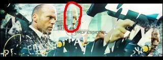
BrokenSaint's recent tutorial, i made this sig which i call "The Professional". focal is Jason Statham, one of my favorite British actors. this was one of my first times using clipping masks to any great extent, and i think i accomplished what i was after, though it also showed me how much room there is to improve.
c/c and ratings pl0x :)

edit:
fena used the same tut and came out with something totally different. rate his as well!!
Posted: Tue Nov 13, 2007 6:25 am
by binnosh
i like thisone too, but like fena's better :p it's not so messy :p
7/10
maybe i'll try making one aswell with his tut xD and comapre it to you guys
Posted: Tue Nov 13, 2007 8:09 am
by 0l3n
Like this one better then fenas (sorry fena) because of the colours and you have a pretty fixed focal, flow is good in this sig to.
Things you need to work on.
Text: Text effekt is not the issue here but the blending of the text is. Try to place the text near your focalpoint and maybe put it behind Jason.
Lighting: Easy, just find the spot for your lightsource brush some white and smudge (you dont have to smudge if you want but it makes it look more natural.
Depth: You have managed to give the sig some depth but there should be even more, if you put the text behind Jason it would take care some of the depth issues but still, try do some more bluring on the backround to make him stand out more.
Think im done

Posted: Tue Nov 13, 2007 9:28 am
by TwelveEleven
the only thing i don't like is the floating headpieces..
Posted: Tue Nov 13, 2007 3:47 pm
by WaX
Looks nice, agree with 1211 im not keen on that piece of head above the text, but meh just my opinion.
overall nice sig.
Posted: Wed Nov 14, 2007 4:43 am
by fena
Wow. I actually like your Sig more than mine, because, like 0l3n said, it has a clear focal point. I love the text as well, and how you worked in the crosshair along with your text.
The only slight and subtle criticism that I have is this:

The duplicated fraction head just looks a little strange to me. That's about it for me. I honestly like it, and how the blurry left side blends into the sharp, crisp colors of the right side, and the upper right hand corner.
8.5/10. The only reason why it isn't higher is because of my personal preference - I've always liked my Sigs to be a little more abstract, is all.
/Off-topic: I think that Jason Statham's a great actor too, although I didn't know his name until now. I saw him in the 2006 remake of The Italian Job, where he was Handsome Rob, and he did a sexy, sexy job, lol.
Posted: Wed Nov 14, 2007 7:15 am
by SuicideGrl
yah everyone seems to have issues w/ my headpiece lol. i'll edit it out tomorrow and see how people like it then.
<OT>Jason Statham is awesome. i loved him in Snatch and Lock, Stock, and Two Smoking Barrels, and in both Transporter movies. he's in incredible shape for someone pushing 40, and he does all his own stunts, which i admire. i was gonna use a screen from Snatch, my favorite movie of all time, but this one, from a recent film that i can't remember the name of, jumped out at me. if you haven't seen Snatch, DO IT. do not pass go, do not collect $200, go immediately to your local video emporium or favorite torrent site and GET IT.</OT>
Posted: Wed Nov 14, 2007 7:27 am
by cin
sui
go watch Crank
ontopic: love the sig style, love both outcomes of BrokenSaint's tut.
i'd gp for an 8/10.
Posted: Wed Nov 14, 2007 7:56 am
by TwelveEleven
cin wrote:sui
go watch Crank
ontopic: love the sig style, love both outcomes of BrokenSaint's tut.
i'd gp for an 8/10.
ya crank is a good movie

Posted: Wed Nov 14, 2007 12:32 pm
by SuicideGrl
TwelveEleven wrote:cin wrote:sui
go watch Crank
ontopic: love the sig style, love both outcomes of BrokenSaint's tut.
i'd gp for an 8/10.
ya crank is a good movie :)
heyyyy that's the flick the sig image is taken from, thanks guys.
Posted: Thu Nov 15, 2007 12:21 am
by SuicideGrl
original:

edit:

no headpiece XD
improvement? i think so.
i ran into the problem i expected to run into when i started using so many "Apply Image" commands. i mentioned it in brokensaint's tut thread... once you apply image, you lose all control over those lower layers. if you wanna change something that is on one of them, you can't.
i used the clone stamp tool for the first time to take pieces of the image from elsewhere and overwrtite the head fragment. handy tool.
Posted: Thu Nov 15, 2007 2:00 am
by Avalanche
is the headpiece to the right also supposed to be there?
Posted: Thu Nov 15, 2007 3:34 am
by [SD]happynoobing
and i thought it was about the movie "The Professional" aka Leon.
Posted: Thu Nov 15, 2007 6:19 am
by SuicideGrl
AvAlAnChE1 wrote:is the headpiece to the right also supposed to be there?
no one commented on that one and said they were bothered by it, so i left it in.
Posted: Thu Nov 15, 2007 7:16 am
by TwelveEleven
TwelveEleven wrote:the only thing i don't like is the floating headpieces..
...
Posted: Thu Nov 15, 2007 7:26 am
by cin
[SD]happynoobing wrote:and i thought it was about the movie "The Professional" aka Leon.
wasnt Leon that french dude? eh.. Jean Reno or something?
Posted: Thu Nov 15, 2007 1:39 pm
by SuicideGrl
<sigh>

Posted: Thu Nov 15, 2007 2:36 pm
by Luoma
SuicideGrl wrote:<sigh>

Looking good!

And yea Crank is a cool movie ^^
edit: lol, yea woops ^^
Posted: Thu Nov 15, 2007 2:39 pm
by Zypher
Jean Reno was Leon
Luc was the Director
Posted: Thu Nov 15, 2007 6:58 pm
by [SD]Kratos
Zypher wrote:Jean Reno was Leon
Luc was the Director
Yup, Luc Besson.
Leon was a great movie too...dam. *searches on r4v3n*
Posted: Sun Nov 25, 2007 6:19 am
by CrimsonNuker
War owns all his other movies.


