Page 1 of 1
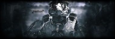
New sig
Posted: Mon Nov 12, 2007 10:37 am
by _HeLLioN_

Any criticism is welcomed, I'm nowhere near half the people here.
Posted: Mon Nov 12, 2007 10:57 am
by cin
i like it.
2 things i would do differently
- i would try and get more depth into it.
i know, you have a background that shows a little depth, but if you make the
left and right of the bg more clear, like they come towards us more, it would look
even better.
- i think i would like a movieborder on this one
thats a border which is a bit thicker on the top and bottom
but, as i said, i like it. 7.5/10
Posted: Mon Nov 12, 2007 11:04 am
by _HeLLioN_
I thought about a movie border, but it's late so I decided on 1px black border.
I'll change that tomorrow.
I'll also try to fix the depth too. How would I go about doing that exactly?
Posted: Mon Nov 12, 2007 11:05 am
by cin
well i'm not a pro at photoshop...
but i might give it a try myself on your piece and post my findings afterwards

what i thought of so far is, like i said, to bring up the left and right side of the
background a bit, so you will have the char in front, the left and right of the bg
a meter or so behind it, and the middle of the bg far behind it
Posted: Mon Nov 12, 2007 11:11 am
by _HeLLioN_
Well I'm not exactly greatness either, but I'll try to do that.
Thanks for the input.
Posted: Mon Nov 12, 2007 3:45 pm
by 0l3n
Try to make MC pop out just a little bit more using the blur tool on the backround and the sharpen tool on MC.
And make the text bigger.
Posted: Mon Nov 12, 2007 3:55 pm
by aazumak
i think its wonderfull, it has good depth, but i would make the edges darker , it would just be spectacular that way
text is nice, thats my only criticism, your up there with teh best man, dont degrade yourself
Posted: Mon Nov 12, 2007 11:20 pm
by _HeLLioN_
0l3n wrote:Try to make MC pop out just a little bit more using the blur tool on the backround and the sharpen tool on MC.
And make the text bigger.
Alright. Blur and sharpen tool. Thanks. I'll update it later.
aazumak wrote:i think its wonderfull, it has good depth, but i would make the edges darker , it would just be spectacular that way
text is nice, thats my only criticism, your up there with teh best man, dont degrade yourself
Ironic. When I was doing this, I thought the edges were too dark. I'll fix them a bit, and also apply what 0l3n said.
Thanks for the comments.
Edit:
Update -

Blurred the background and sharpened the MC. Made the sides darker and added a movie border as cin suggested.
Posted: Tue Nov 13, 2007 4:03 am
by SuicideGrl
i like it. i <3 MC. i think you may have sharpened him TOO much though.
Posted: Tue Nov 13, 2007 5:17 am
by _HeLLioN_
Another friend said that.
He suggested that I use eraser with the flow set real low and touch it up a bit.
Posted: Tue Nov 13, 2007 5:46 am
by SuicideGrl
_HeLLioN_ wrote:Another friend said that.
He suggested that I use eraser with the flow set real low and touch it up a bit.
the blur tool would work as well.
OR, something i do often that i think works well here, is you could apply image and then do a pretty heavy gaussian blur on the image (like 4px), and then set the opacity of the applied one real low (like 10-20%) and just erase the parts of that layer you want sharp. just a thought.
Posted: Tue Nov 13, 2007 5:47 am
by _HeLLioN_
I'll figure something out and post it here.
Thanks for the tips.


