Page 1 of 1
NSR - Mario
Posted: Mon Oct 29, 2007 9:13 pm
by 0l3n
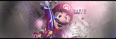
You know the drill

Started on this one 5 days ago, went away for a few days.
Posted: Mon Oct 29, 2007 9:29 pm
by Waisha
lovin it, one of the best sigs I've seen.
10/10.
Posted: Mon Oct 29, 2007 9:59 pm
by Millenium
I love it. I personally prefer the colors on Mario to be more vivid.
8.5/10 for the dull colors.
Posted: Mon Oct 29, 2007 10:49 pm
by Shadowman20818
greecemilly wrote:I love it. I personally prefer the colors on Mario to be more vivid.
8.5/10 for the dull colors.
Agreed, think there should be more contrast between mario and the background, love everything else though.
Also, it's been a while since you posted new art...
Posted: Tue Oct 30, 2007 12:17 am
by christina
do you have any tutorails?
I could'nt find one
9/10
Like it
Posted: Tue Oct 30, 2007 7:01 am
by MasterKojito
9.7/10
looks Good!! But I don't like the left side, it is to plain for me.
Posted: Tue Oct 30, 2007 7:05 am
by WaX
Yea kinda agree with the colour thing but i really like the look of it overall,nice job

8-9/10
Posted: Tue Oct 30, 2007 7:31 am
by 0l3n
Thanks everyone for the comments, dono if I can fix the colouring on the sides.
And it has been quite a while since I posted any art, last art piece was for AC Teams called "gaypride"

PS: Im not gay.
Posted: Tue Oct 30, 2007 4:04 pm
by TwelveEleven
0l3n wrote:PS: Im gay.
too true! xD
anyways, i'm not really digging it, mostly because mario seems a lil' dull, and the blue lines (laser-ish), doesn't fit with mario to me..
7.5/10
Posted: Wed Oct 31, 2007 3:49 pm
by Kayson
8/10
I really like it. Mario looks good, and this sig has some really nice looking colors. Really seems to go together.
Nice work.
Posted: Wed Oct 31, 2007 8:36 pm
by gamef
Great sig, 9/10.
Posted: Wed Oct 31, 2007 8:48 pm
by Itonami
Hehe i like it
Posted: Thu Nov 01, 2007 10:31 am
by 0l3n
Itonami wrote:Hehe i like it
39